
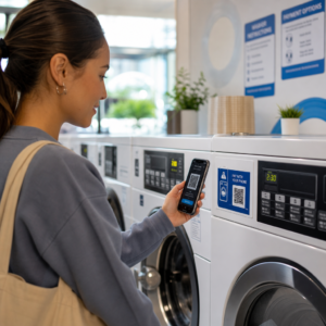
Do you ever find potential customers ignoring your printed flyers because typing a URL feels like too much effort? This friction often leads to wasted printing budgets and missed opportunities to capture leads. By following a few technical design standards, you can transform static brochures into interactive tools that drive immediate digital engagement.
Why Precision Matters in Print Marketing
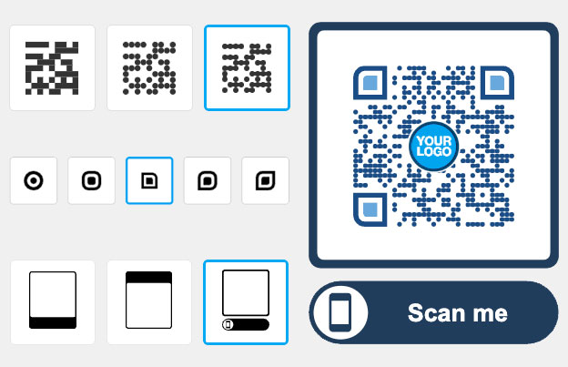
Integrating a QR code into your print media turns a static piece of paper into an interactive gateway. However, a code that is too small or blurry will frustrate users and damage your brand’s credibility. Using dynamic QR codes is a critical first step because they allow you to update the destination URL even after the flyers are distributed. This flexibility saves you from expensive reprinting if a link changes or a promotion ends.
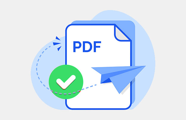
Need to link a flyer to a digital menu or manual? Use our PDF QR Code Generator to host your documents and share them instantly with a single scan.
Beyond simple links, these codes provide real-time analytics that show how many people are interacting with your physical materials. This data allows you to measure the ROI of your print campaigns just as you would with a digital ad, making it easier to see how QR codes connect print and digital marketing strategies.
Choosing the Right Size and Resolution
The most common reason QR codes fail on flyers is incorrect sizing. A code must be large enough for a smartphone camera to resolve the individual modules – the small squares – at a comfortable reading distance. For brochures held at arm’s length, the code should be at least 0.8 x 0.8 inches (2 x 2 cm) to maintain readability across different devices.
- Maintain a 10:1 ratio where the code is at least 1 inch wide for every 10 inches of expected scanning distance.
- Ensure the design uses a resolution of at least 300 DPI to prevent pixelation during the professional printing process.
- Download your codes in vector formats like SVG or EPS so they remain perfectly sharp even if you need to scale them up for posters.
- Adjust the size based on the texture of your paper, as rougher materials may require larger codes to keep the modules distinct.
When planning your layout, refer to specific guidelines regarding sizing for different print materials to ensure your specific paper choice doesn’t interfere with the camera’s focus.
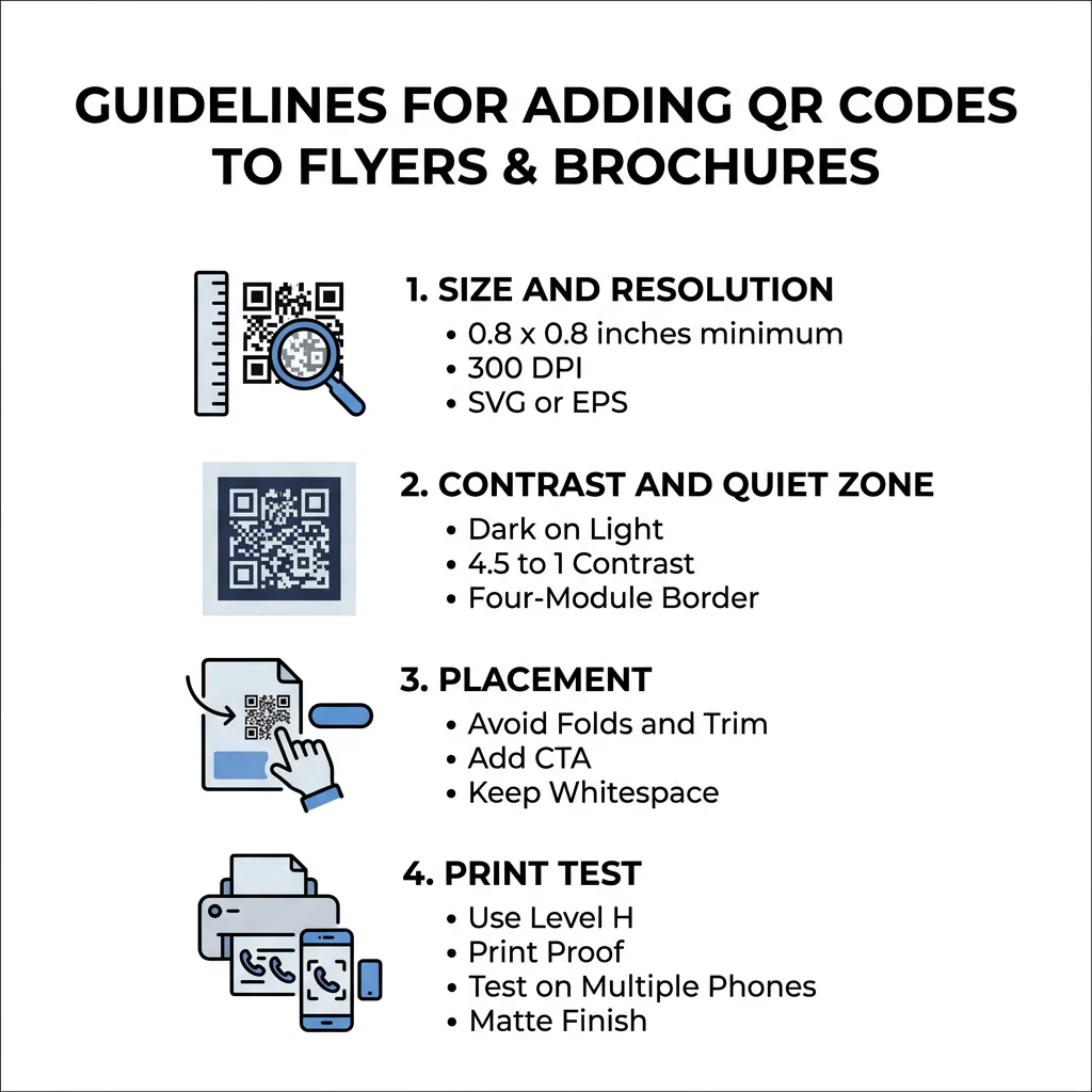
Optimizing Color Contrast and Quiet Zones
Scanners rely on the difference in light reflection between the dark modules and the light background to decode information. If the contrast is too low, the camera sensor cannot distinguish the data from the background. You should aim for a contrast ratio of at least 4.5:1 to ensure the code is accessible to all users.
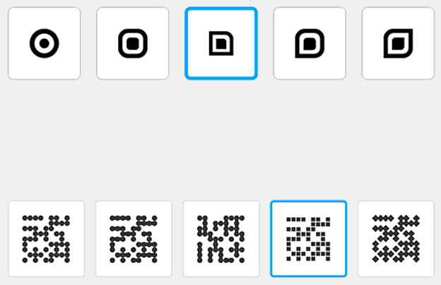
While custom branding is important, the most reliable combination remains a dark foreground on a light background. You should generally avoid inverted colors, as many older scanning apps and certain lighting conditions make light-on-dark codes difficult to read.
Every QR code also requires a quiet zone, which is a plain border that separates the code from surrounding text or graphics. According to global standards, this border should be at least four modules wide on all sides. Think of this as a protective buffer; without it, the scanner may mistake nearby design elements for part of the code itself, leading to a “no-scan” result.
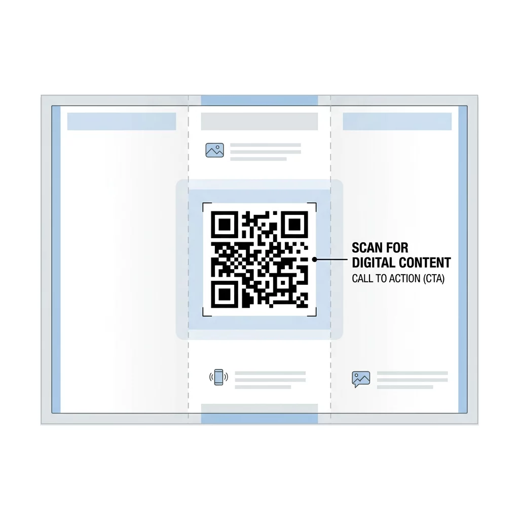
Strategic Placement for Maximum Engagement
Where you place the code on your layout is just as important as how it looks. You must ensure the code remains flat and unobstructed to prevent the distortion that occurs when modules are bent or cut.
- Keep the code away from folds, creases, or “bleed” edges where the paper will be trimmed during production.
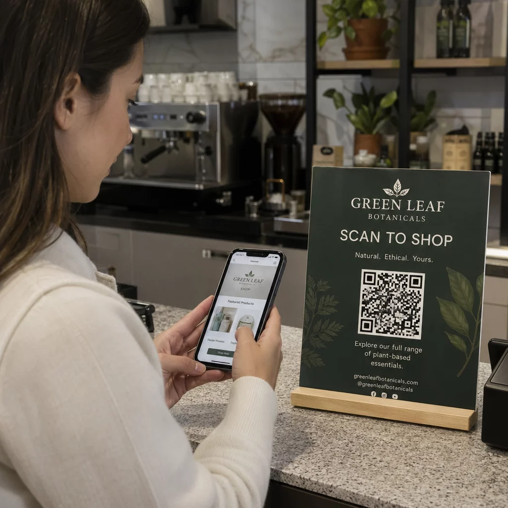
- Position the code in a high-traffic visual area, such as the bottom right corner of a flyer or the center of a back panel.
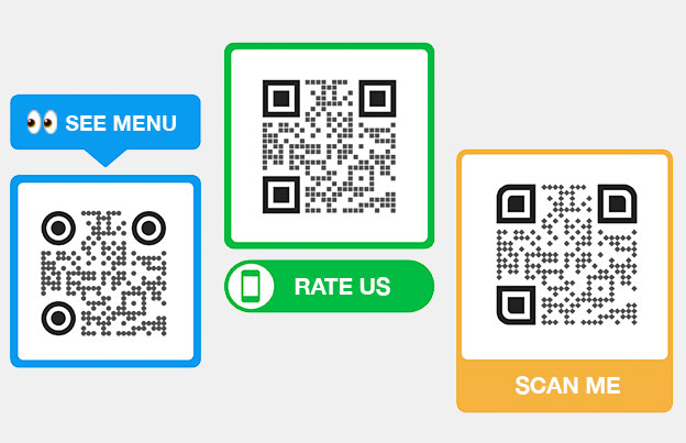
- Include a clear call-to-action (CTA) like “Scan for 20% Off” or “Scan to View Menu” to give users a reason to interact.
- Leave enough whitespace around the code so it does not compete with busy images or heavy blocks of text.
Using a descriptive CTA can significantly boost interaction rates. Evidence suggests that providing a clear benefit or incentive can more than double your total scan volume compared to a standalone code without instructions.
Ready to create a branded code for your next campaign? Use our Link QR Code Generator to customize colors, add your company logo, and generate high-resolution files.
Technical Quality Checks Before Printing
Before committing to a large print run, you must perform a final quality check to prevent technical failures. A low-resolution image might look acceptable on a computer screen but can appear blurry or pixelated once it hits the paper.
- Verify that the destination URL is active and leads to a mobile-friendly landing page.
- Use Level H (High) error correction for printed materials, which allows the code to function even if up to 30% of it is damaged or scratched.
- Print a physical proof at 100% scale and test it with multiple smartphone models in different lighting conditions.
- Utilize a digital print quality checker to confirm your file meets resolution and contrast requirements before sending it to the printer.
Selecting the right paper finish also plays a role in success. Glossy finishes often create glare that “blinds” the camera sensor, while matte finishes reflect light more evenly. If you are unsure how your chosen material will react, you can read more about how printing techniques impact QR code scannability to avoid common production pitfalls.
Frequently Asked Questions
The absolute minimum size for a functional QR code is 0.4 x 0.4 inches (10 x 10 mm), but this is only recommended for high-resolution prints viewed at very close range. For standard marketing materials like flyers and brochures, a size of 0.8 x 0.8 inches (20 x 20 mm) is the standard for reliable scanning.
You can change the destination URL only if you use a dynamic QR code. Dynamic codes use a redirect link, which allows you to log into your dashboard and update the target website or file at any time without needing to change the printed artwork on your brochures.
Glossy paper often creates a mirror-like reflection or “specular reflection” that washes out the modules when viewed under bright lights. To fix this, you can use a matte varnish over the QR code area, increase the contrast between the modules and the background, or move the code to a section of the design with less ink saturation. By adhering to these technical standards, you ensure that your flyers and brochures act as effective gateways for customer interaction. Successful integration relies on the balance of high-resolution vector files, sufficient contrast, and strategic placement away from folds. For the best results, always start with a dynamic code and test a physical proof before finalizing your print order.


