Are you worried that adding a logo to your QR code will make it impossible to scan? A non-functional code frustrates customers and wastes marketing resources on unreadable prints. This guide shows you how to use error correction and design standards to create branded, reliable QR codes.
How Error Correction Enables Branded Designs
The technical foundation that allows you to overlay a logo is Reed-Solomon error correction. This technology adds redundant data to the code, allowing a scanner to reconstruct the original information even if a portion of the grid is covered or damaged. Think of the scanner like a high-speed reader that can piece together a sentence even if a few words are blurred.
There are four specific levels of error correction defined by the ISO/IEC 18004 standard:
- Level L: Recovers approximately 7% of data, intended for basic codes without customization.
- Level M: Handles about 15% recovery, suitable for simple color changes.
- Level Q: Restores around 25% of data, often used for small icons.
- Level H: Recovers up to 30% of data and is the standard requirement for adding a brand logo.
When adding a logo, you should always select Level H (High). This ensures that while your logo obscures some data modules, the scanner still has access to the remaining 70% of the code required to successfully process the link.
Essential Design Rules for Logo Placement
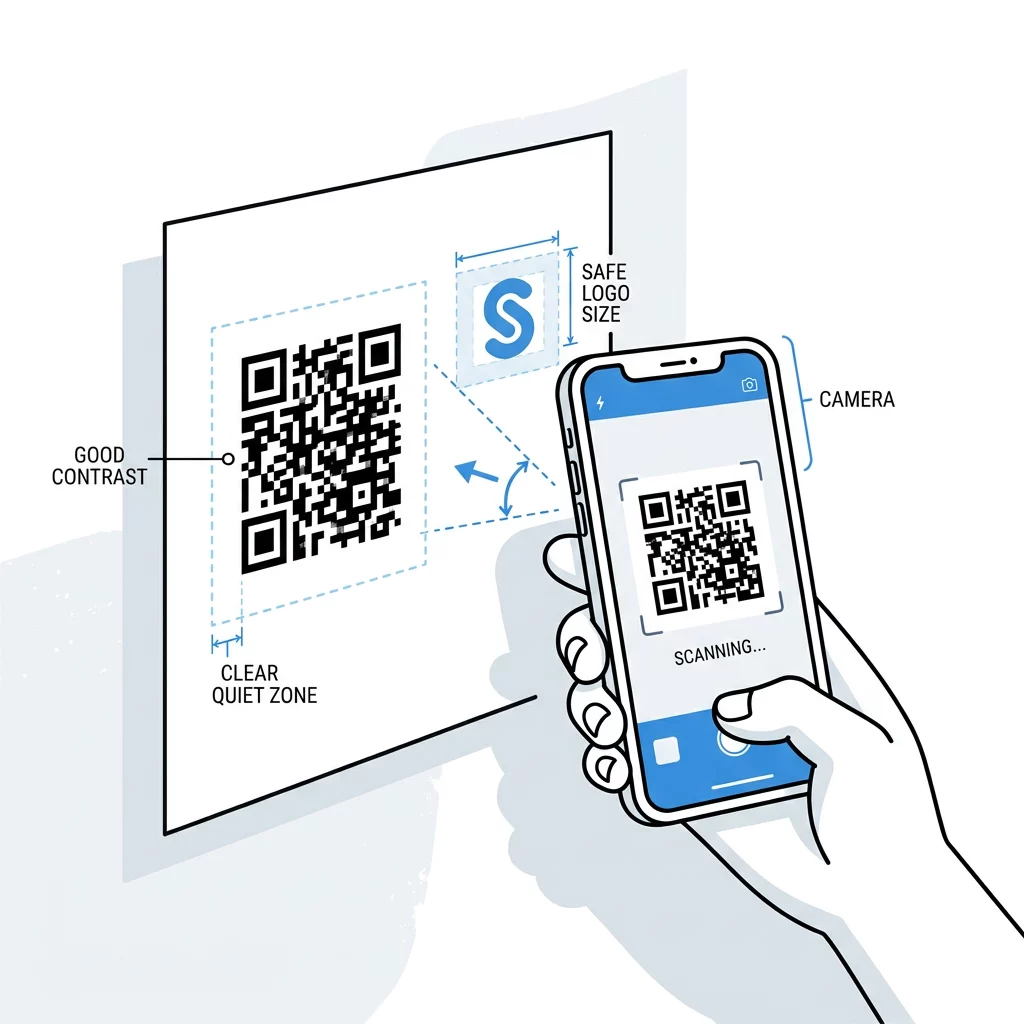
While error correction provides a safety net, placing a logo haphazardly can still lead to scan failures. You must follow specific QR code design tips to maintain the structural integrity of the code. Scanners typically prioritize the corners and edges to orient themselves before reading the internal data.
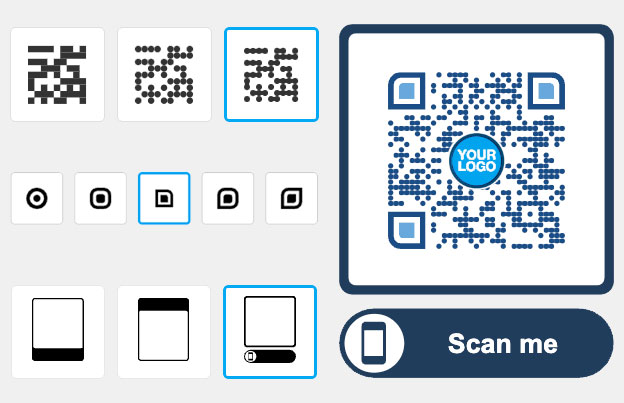
- Keep the logo centered in the data area to avoid interfering with the finder patterns.
- Limit the logo size to no more than 20% to 30% of the total QR code area.
- Ensure the logo does not cover the three large squares in the corners, known as finder patterns.
- Avoid obstructing alignment or timing patterns, which are the smaller tracking elements within the grid.
Maintaining the Data Area and Quiet Zone
Beyond the internal patterns, you must protect the “quiet zone,” which is the blank margin surrounding the code. According to the ISO/IEC 18004 standard, this border should be at least four modules wide. Just as a physical frame separates a painting from the wall, the quiet zone separates the QR code from other graphic elements on your packaging or flyers. This helps the camera recognize where the code begins and ends.
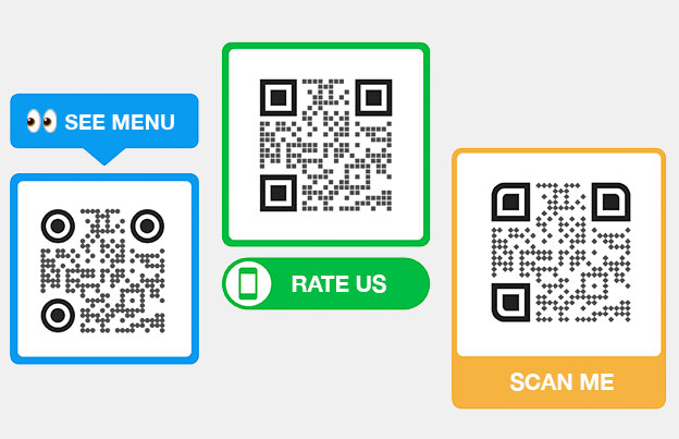
Boost your brand visibility and engagement by using the QR code generator with logo to create a professional, scannable experience.
Why Contrast and Size Dictate Scanning Success
Scanners work by identifying the difference between light and dark modules. Darker colors absorb more light, while lighter colors reflect it back to the camera lens. If your logo or the modules themselves lack contrast, the scanner will struggle to identify the pattern.
- Maintain a contrast ratio of at least 4.5:1 between the foreground and background.
- Use dark modules on a light background, as inverted colors (light on dark) are often harder for older devices to recognize.
- Avoid using gradients or shadows inside the code, as these create mid-tones that confuse the scanning algorithm.
Physical dimensions are equally important for usability. For standard marketing materials like business cards or flyers, follow a QR code size guide and ensure the code is at least 0.8 x 0.8 inches (2 x 2 cm). If you are encoding a large amount of data or using a complex logo, you should increase the size to at least 1.2 x 1.2 inches to keep the modules distinct and readable.
Validating Your Code Through Testing
The final step in ensuring QR code usability is rigorous validation. You should never send a branded design to print without performing QR code testing across different devices and environments. Because different smartphone cameras use various processing algorithms, a code that works on a new iPhone might fail on an older Android device.
- Scan the code using both iOS and Android native camera apps and third-party scanners.
- Test the code under varied lighting, including bright sunlight which can cause glare and dim indoor settings.
- Verify the scan from different distances and angles to simulate how a customer will interact with it in the real world.
If you find that the code takes too long to load or fails under certain conditions, consider switching to dynamic QR codes. These codes use a shorter, simplified URL to reduce the density of the modules, making the overall design much easier for cameras to scan even with a logo in the center.
FAQ
Square or circular logos are the most effective because they fit naturally into the center of the grid. Horizontal or vertical rectangular logos are more likely to stretch into the finder or timing patterns, which can break the scannability of the code.
You can add a logo to most QR codes, but it is most effective when using high error correction (Level Q or H). High-density codes, such as those containing a large amount of text, become very “busy,” so using a logo on a low-density link or dynamic code is usually safer.
A logo is a design element and does not affect the expiration of the code itself. However, if you are using a dynamic code to manage your branding, ensure your platform subscription is active so the destination remains functional. Adding a brand logo is a powerful way to build trust and increase scan rates on your marketing materials. By following technical standards for error correction and contrast, you can ensure your codes are as functional as they are beautiful. Ready to build your own? Start creating with the Pageloot QR code generator today.


