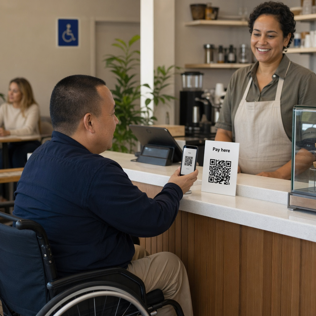
Are you unintentionally excluding customers by using inaccessible QR code payments? When digital checkouts are difficult to navigate, businesses lose revenue and alienate millions of users with disabilities. This guide provides actionable best practices to implement inclusive, secure, and user-friendly QR code payment systems.
Essential QR Code Design for Accessibility
Designing a payment system that everyone can use requires focusing on clarity and visibility. You should treat the QR code not just as a technical link, but as a user interface element that must be identifiable and functional for people with visual or motor impairments.
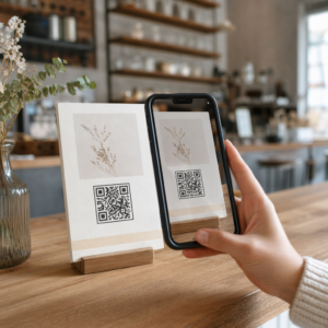
A critical foundation for scannability is the “quiet zone,” which is the empty border surrounding the code. Following QR code usability best practices, this margin should be at least four times the width of a single black module to ensure scanners can distinguish the code from surrounding text or graphics. For physical displays, you must also consider the scanning distance. A reliable rule of thumb is a 10:1 ratio, meaning a code viewed from 10 inches away should be at least 1 inch wide. For most retail environments, a minimum size of 2 x 2 inches (5 x 5 cm) ensures that users with tremors or limited motor control can easily steady their device and capture the scan.
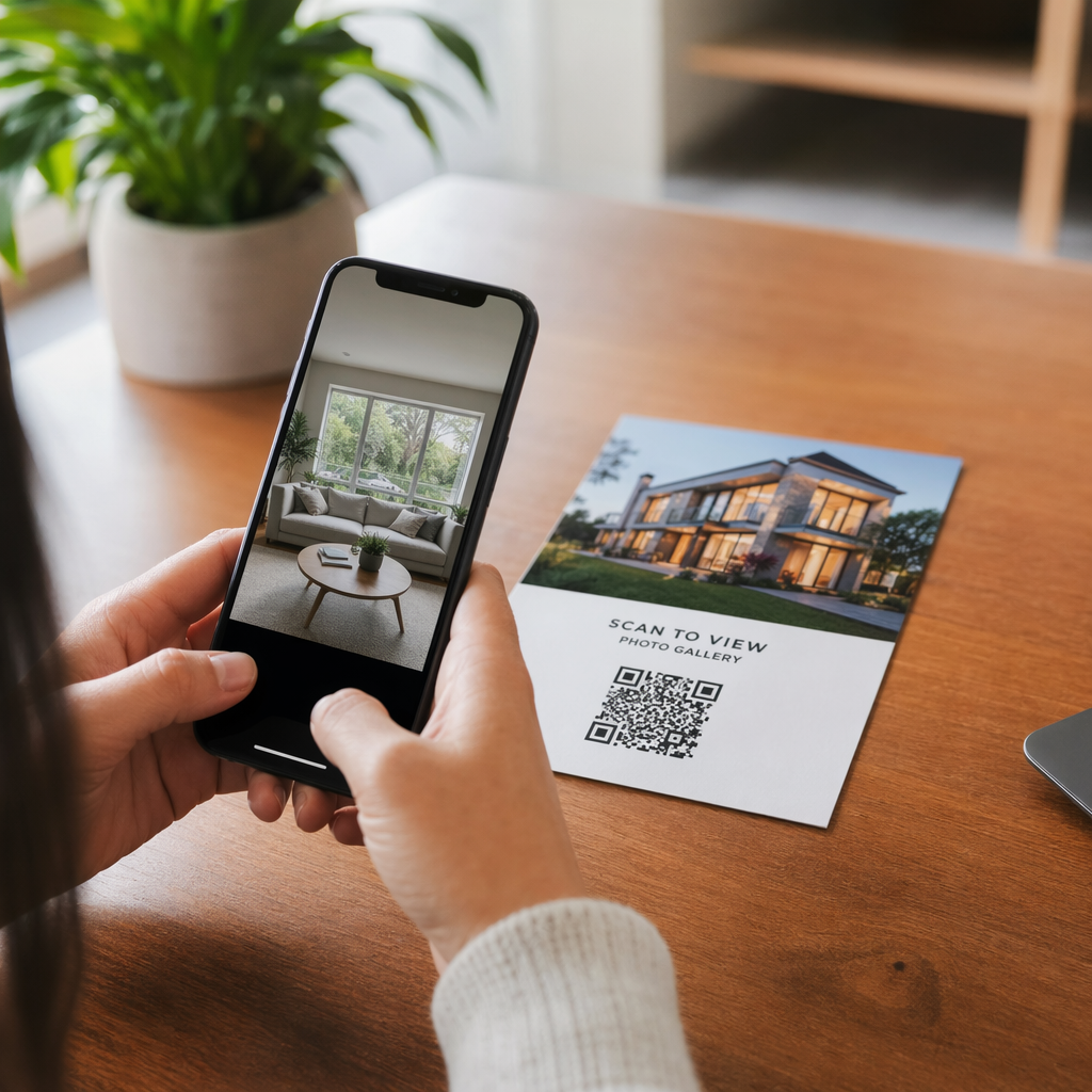
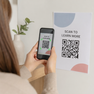
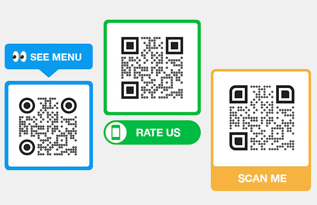
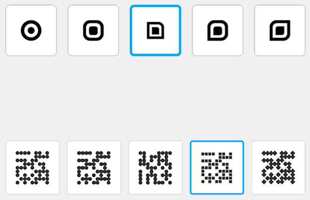
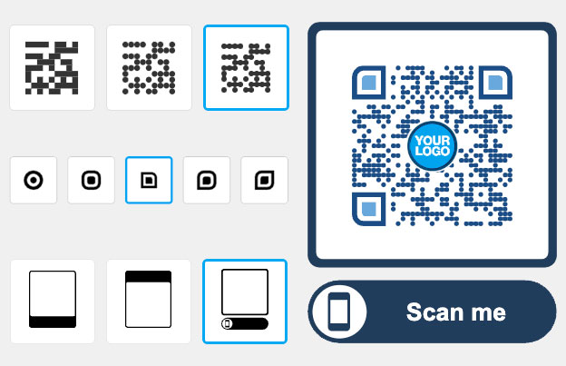
Beyond the physical dimensions, providing clear context is vital. You should include descriptive text adjacent to the code, such as “Scan this code to pay your bill.” This helps visually impaired users who rely on screen readers to understand the purpose of the interaction before they scan. Adding a business logo or branded frame also builds trust, signaling to the customer that the payment link is legitimate and secure.
Why Contrast is the Foundation of Scannability
High contrast is the most important factor for making a QR code readable in various lighting conditions. Scanners rely on the distinction between the dark modules and the light background to decode information quickly. While black-on-white remains the gold standard, you can use brand colors if you maintain a high contrast ratio.
According to QR code color contrast best practices, you should aim for a minimum contrast ratio of 4.5:1 to meet WCAG 2.1 AA standards for accessibility. You should avoid using light-colored codes on dark backgrounds, as many older camera sensors and scanning apps struggle with inverted colors. Solid colors are always preferable to gradients or shadows, which can create mid-tones that confuse the scanner. Testing your designs in grayscale is a practical way to ensure the contrast remains sharp even for users with color vision deficiencies.
Implementing Alternative Access Methods
A truly inclusive checkout experience provides multiple ways to reach the payment portal. Not every user will have a modern smartphone or the physical ability to hold a device steady for a scan. Offering a backup method, such as a short, easy-to-type URL, ensures that no one is left unable to complete a transaction.
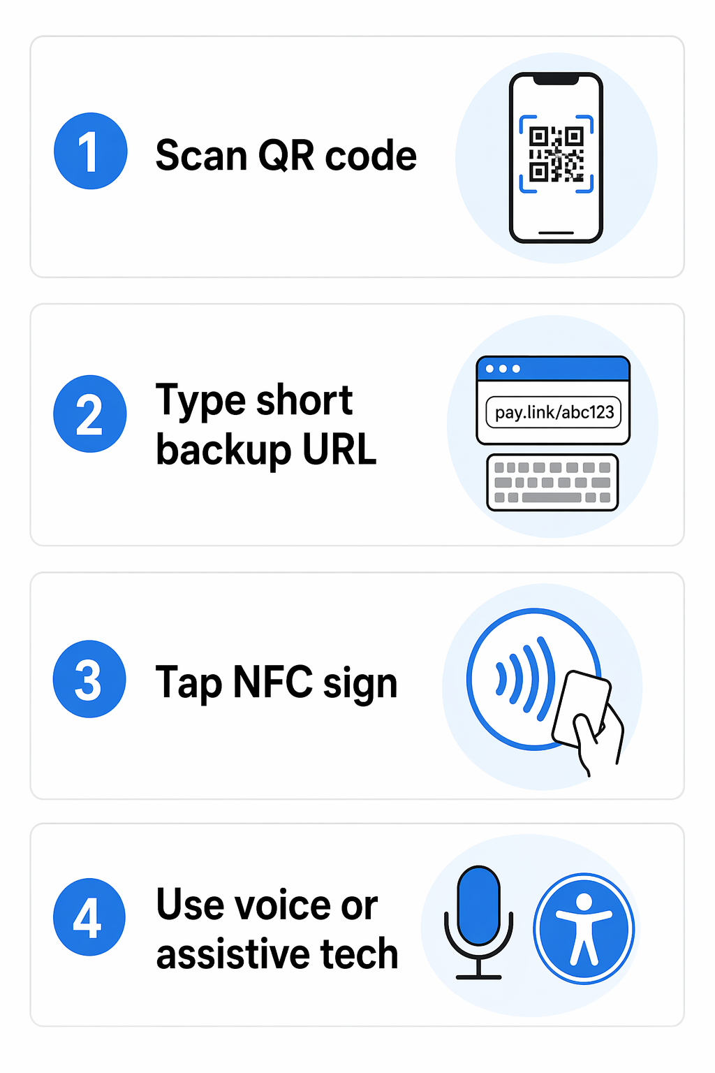
Another effective alternative is the use of Near Field Communication (NFC) tags. By embedding an NFC chip in your payment display, customers can simply tap their phone against the sign rather than aiming their camera. This is particularly helpful for individuals with significant motor impairments. Furthermore, voice-activated QR codes enhance accessibility by allowing users to interact with the payment platform through natural speech once the link is opened, creating a hands-free experience that integrates with existing assistive technologies.
Security and Compliance in Accessible Payments
Security is a primary concern for users with disabilities, who may be more vulnerable to phishing if they cannot easily inspect a URL before clicking. Using branded, customized codes helps users identify legitimate systems. More importantly, businesses must follow a QR code payments PCI-DSS compliance guide to protect cardholder data through encryption and tokenization.
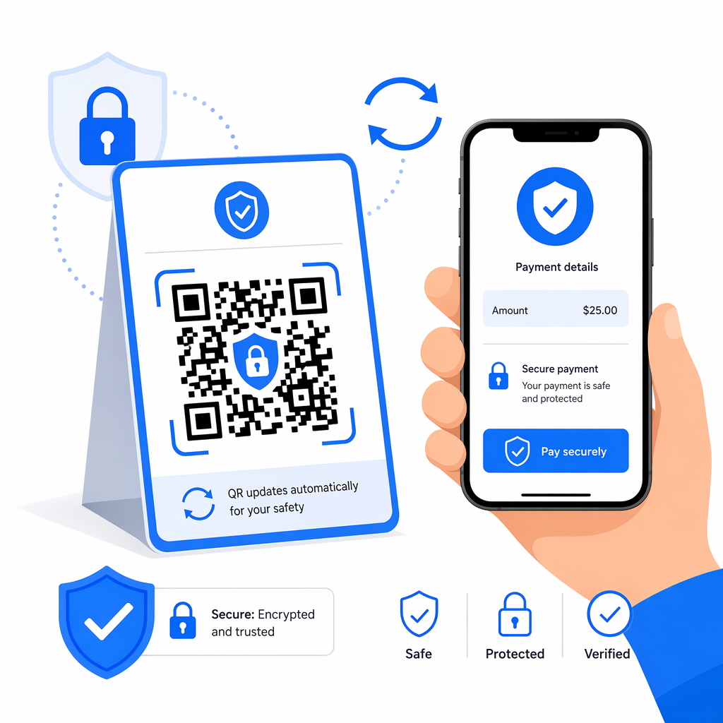
To further mitigate risks, you should prioritize the use of dynamic QR codes. Unlike static codes, which contain fixed data that cannot be changed, dynamic codes allow you to update the destination URL or deactivate the link instantly if fraud is detected. This flexibility also prevents “broken link” issues, such as when a domain expires – a problem that famously led to users being redirected to inappropriate content in a past Heinz marketing campaign. By monitoring QR code risks in payments, you can use real-time analytics to spot unusual scan patterns, such as a payment code intended for a local shop being scanned from an international location, and take immediate action.
Accept Secure Payments Instantly Ready to implement a professional and inclusive checkout experience? Use our Payment QR Code Generator to create secure, brandable, and easy-to-scan codes for your business today.
Monitoring and Optimizing the Payment Journey
Once your system is live, you must track its performance to ensure it remains accessible. If your analytics show a high scan rate but a low completion rate, there may be accessibility barriers on the payment page itself. You should ensure that your digital checkout is mobile-responsive, supports keyboard navigation, and loads quickly on slow cellular networks.
Improving the security and speed of QR code payments helps reduce “checkout friction.” For example, integrating with biometric authentication like FaceID or fingerprint scanning allows users to authorize payments without typing complex passwords. You should also provide immediate feedback after a successful scan, such as a haptic vibration or a clear audio confirmation, so users with visual impairments know the transaction is processing.
Accessibility Checklist for Business Owners
- Use a minimum size of 2 x 2 inches for printed codes to assist users with motor impairments.
- Ensure a contrast ratio of at least 4.5:1 between the QR code and its background.
- Include a visible text label and a short URL near the code as a backup.
- Maintain a clear “quiet zone” of at least four modules around the code.
- Position codes between 15 and 48 inches from the ground to remain reachable for wheelchair users.
- Use dynamic codes to enable real-time updates and fraud monitoring.
- Test the final payment destination with screen readers to ensure full compatibility.
By following these guidelines, you can create a checkout process that is not only faster and more secure but also open to every customer, regardless of their physical abilities.
Frequently Asked Questions
The most accessible combination is a black foreground on a white background. This provides the maximum possible contrast (21:1), making it the easiest for both human eyes and mobile scanners to recognize in low-light or high-glare environments.
Dynamic codes allow you to update the destination URL without reprinting the physical code. This is essential for fixing broken links instantly or redirecting users to a more accessible version of a payment page as your technology evolves.
Yes, for wall-mounted displays, you should place codes between 15 and 48 inches from the ground. This range ensures that the code is within reach and at a comfortable scanning angle for users in wheelchairs or those with limited reach.


