
Are your customers struggling to scan the QR codes on your marketing materials? A code that fails to scan creates immediate frustration, kills consumer trust, and wastes your printing budget. This guide provides a technical checklist to ensure your QR codes work reliably across every device and environment.
Prioritize Size Based on Scanning Distance
The most common reason for scanning failure is a code that is simply too small for the camera to resolve. You must balance the physical dimensions of the QR code with the distance from which you expect a user to scan it. For close-range items like business cards or product packaging, you should never go smaller than 0.8 x 0.8 inches (2 x 2 cm). As the distance increases, so must the size of your code.
A reliable industry standard is the 10:1 rule: for every 10 inches of scanning distance, the QR code should be at least 1 inch wide. For example, if a user is scanning a poster from 10 feet away, the code should be approximately 1 foot wide to ensure the camera sensor can lock onto the pattern. Understanding how QR code size impacts visibility is essential, as denser data requires larger modules to remain readable. When designing for small formats, it is often helpful to consult specific guidelines on the best QR code sizes for business cards to prevent pixelation during the printing process.
Maintain High Color Contrast
Scanners identify data by distinguishing between light and dark modules. If the contrast is too low, the camera cannot identify the pattern, leading to an abandoned scan. You should always aim for a dark foreground on a light background. Think of the scanner like a high-speed reader that needs a clear visual “pop” to separate the data from the noise. Darker colors absorb more light, while lighter colors reflect it, creating the necessary distinction for the sensor.
While some modern smartphones can handle inverted colors, many older devices or third-party apps will fail. To ensure universal compatibility, you should follow these contrast guidelines:
- Maintain a minimum contrast ratio of 4.5:1 to meet WCAG AA accessibility standards.
- Avoid using gradients or shadows inside the code, as these create mid-tones that confuse the scanning software.
- Stick to classic combinations like black on white, which provides the highest possible reliability with a 21:1 ratio.
- Test custom brand colors under various lighting conditions, as what looks good on a screen may wash out under direct sunlight.
For a deeper look at choosing a palette that balances branding with functionality, you can review our QR code color contrast best practices.
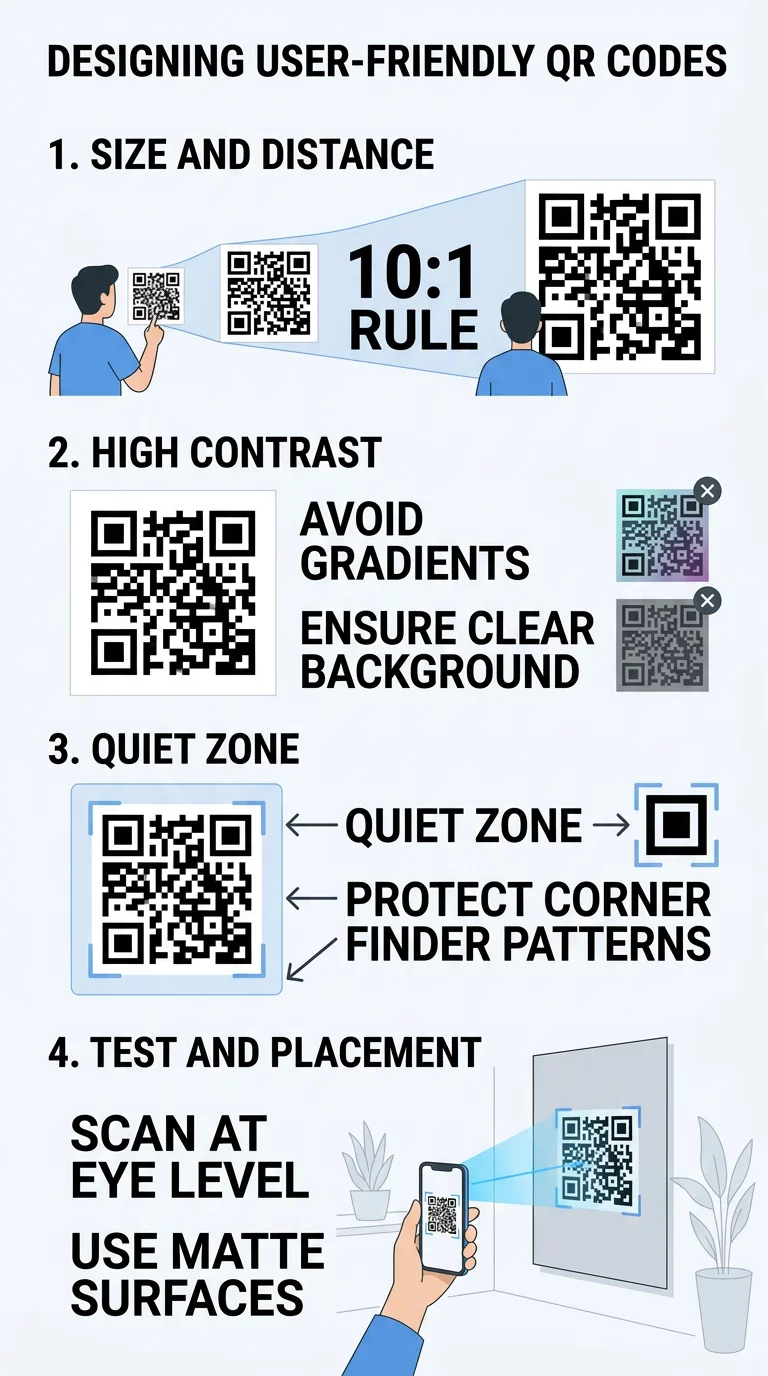
Protect the Quiet Zone and Symbol Structure
The “Quiet Zone” is the empty margin surrounding the QR code that tells the scanner where the code starts and ends. According to ISO/IEC 18004 standards, this buffer must be at least four modules wide on all sides. Encroaching on this space with text, images, or package edges can prevent the scanner from recognizing the symbol. If you are working with limited space, it is always better to reduce the overall size of the QR code slightly rather than shrinking the quiet zone.
Beyond the margin, you must protect the finder patterns – the large squares located in three of the corners. These patterns allow the scanner to orient itself and determine the code’s size and angle. Obstructions here are the most frequent cause of total scan failure. By keeping these areas clear, you ensure that even users with older hardware or lower-resolution cameras can successfully interact with your content.
Select the Right Error Correction Level
Error correction is a technical feature that allows a QR code to remain scannable even if it is partially dirty, damaged, or obscured. This is made possible by the Reed-Solomon algorithm, which adds redundant data to the code. You should choose your error correction level based on the expected environment of your code. Level L (7%) is suitable for clean, digital displays, while Level M (15%) is the standard for most print marketing.
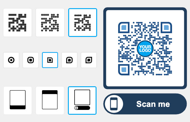
If your code will be placed outdoors or on high-traffic surfaces like vehicles, you should move to Level Q (25%) or Level H (30%) to account for potential scratches or fading. To understand the trade-offs between data capacity and durability, you can learn more about how error correction works in modern designs. Using higher levels of correction is particularly important when you want to add logos to QR codes, as the logo itself acts as a form of “damage” to the data modules that the error correction must overcome.
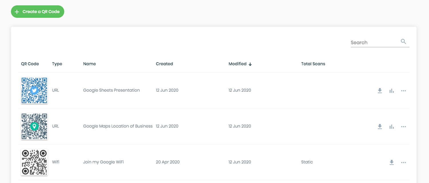
Use Dynamic QR Codes for Cleaner Designs
Static QR codes store all information directly in the pattern, meaning a long URL results in a dense, complex grid that is difficult for cameras to resolve. In contrast, dynamic QR codes use a short redirect URL. This results in a simpler pattern with larger modules, making the code much easier to scan from a distance or in low light.
The benefits of dynamic technology go beyond scannability. Because the code points to a redirect, you can update the destination link at any time without reprinting your materials. This flexibility can lead to significant cost savings; for instance, Marriott Aruba reportedly saved approximately $150,000 by switching to dynamic codes for their menus. Furthermore, dynamic codes provide detailed analytics, allowing you to track scan locations, device types, and engagement rates. Before you finalize your campaign, ensure you understand the differences between static vs dynamic QR codes to choose the right tool for your goals.
Create Professional Codes: Use our Dynamic QR Code Generator to build high-performance, editable codes that include real-time scan tracking and branding options.
Optimize Placement and Accessibility
Even a technically perfect QR code will fail if it is placed where users cannot scan it comfortably. Position your codes at eye level – typically between 3 and 5 feet – to ensure they are within reach. You should also consider the physical surface of your material. Glossy lamination or glass can create glares that “blind” camera sensors, so matte finishes are generally preferred. Avoid placing codes on curved surfaces like bottles or near the folds of a package, as the resulting distortion can prevent the modules from aligning correctly.
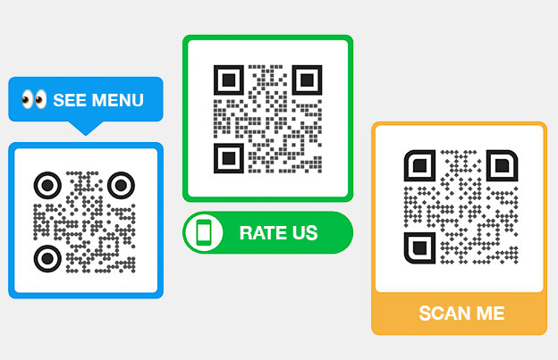
Beyond physical placement, you can improve engagement by making your codes accessible to all users. This includes providing clear instructions and context, such as “Scan for a 20% discount.” You can also explore how voice-activated QR codes enhance accessibility for individuals with visual impairments. Finally, always test your design using a QR Code Scanner on multiple devices and under various lighting conditions before committing to a full print run. For a final quality check, follow the best practices for QR code readability to ensure your physical touchpoints connect seamlessly with your digital content.
FAQ
The practical minimum size for a printed QR code is 0.8 x 0.8 inches (2 x 2 cm). If your code contains a significant amount of data or uses high error correction, you should increase this to at least 1.2 x 1.2 inches to ensure the individual modules remain large enough for a smartphone camera to distinguish.
Yes, but only if you use a dynamic QR code. Dynamic codes use a redirect URL that allows you to change the destination link or file anytime via a management dashboard without changing the printed design itself. Static QR codes have the data hard-coded into the pattern and cannot be updated.
The most likely reason is insufficient contrast between the foreground and the background. Scanners require a contrast ratio of at least 4.5:1. If you use light colors for the code or a dark background without an inverted-mode scanner, the software will not be able to identify the data modules.
By following these design principles, you can transform a simple QR code into a reliable bridge between your offline and online marketing. To begin creating and tracking your own custom codes, visit our QR code generator today.


