
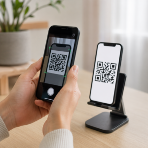
Does your printed QR code look professional on screen but fail to scan when it hits the physical world? Inconsistent resolution and incorrect sizing are the leading causes of scan failures, which can result in wasted marketing spend and lost customer engagement. This guide provides the technical specifications and best practices needed to ensure your codes work perfectly on any material.
Why Resolution Defines Scannability
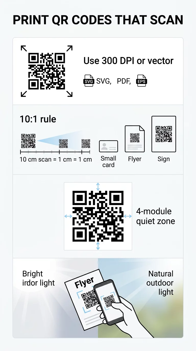
The resolution of a QR code determines how easily a smartphone camera can distinguish between the individual black and white modules. When a code is printed at a low resolution, the edges of these squares become blurred or pixelated, making it impossible for a scanner to interpret the encoded data. For professional results, you should always aim for a minimum of 300 DPI (dots per inch). While a lower DPI might appear acceptable on a digital display, the physical printing process requires much higher detail to maintain sharp borders between the modules.
To avoid the risk of pixelation entirely, you should prioritize vector file formats over raster images. Vector files, such as SVG, EPS, or PDF, are mathematically defined, meaning they can be scaled to any size – from a postage stamp to a billboard – without losing any clarity. If you must use raster formats like PNG or JPG, ensure the source file is high-resolution and never attempt to upscale a small image. Before you finalize your design for mass production, it is helpful to use a QR code print quality checker to verify that your digital assets meet professional standards.
Determining the Physical Size for Different Materials
The physical dimensions of your QR code must be directly proportional to the distance from which you expect users to scan it. An industry-standard guideline is the 10:1 scan distance ratio, which suggests that the width of the code should be approximately 1/10th of the scanning distance. For example, if a consumer is expected to scan a poster from 20 inches away, the QR code should be at least 2 inches wide to be easily captured by a standard smartphone camera.
The material and use case also dictate the minimum reliable size. While a code on a business card can be relatively small because it is held close to the eyes, packaging and signage require more surface area to remain functional. You can find more specific guidelines in our article on QR code sizing for different print materials.
| Material Category | Recommended Minimum Size | Typical Scan Distance |
|---|---|---|
| Business Cards | 0.8 x 0.8 inches (2 cm) | 4–8 inches |
| Flyers and Brochures | 1.2 x 1.2 inches (3 cm) | 12–20 inches |
| Product Packaging | 1.0 x 1.0 inches (2.5 cm) | 10 inches |
| Storefront Signage | 2.0 x 2.0 inches (5 cm) | 20+ inches |
| Billboards and Banners | 12+ inches (30 cm) | 10+ feet |
Building on the foundation of size, you must also consider the layout of the specific medium. For example, business card design with QR codes should keep the code in a prominent, flat area to avoid fingers covering the modules or edges during a scan.
Balancing Data Density and Print Clarity
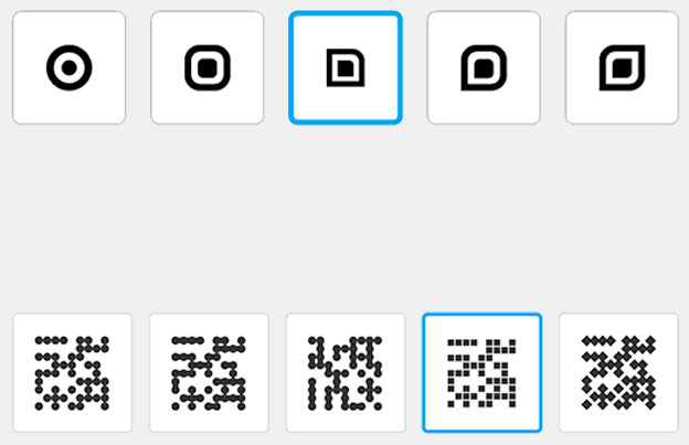
Beyond physical size, the density of the pattern plays a critical role in scannability. When you encode a large amount of information – such as a long URL with multiple tracking parameters – the QR code creates a denser grid with smaller modules. These tiny squares are much more susceptible to printing errors, such as ink bleed, which can bridge the gap between modules and break the code.
To maintain a clean and scannable design, we recommend using dynamic QR codes. These codes store a short, redirecting URL, which keeps the visual pattern simple and the modules large, regardless of how long the destination link is. If you want to understand how different types of information affect the grid, you can read more about how much data a QR code can store. Additionally, using a higher error correction level (Level H) allows the code to remain functional even if up to 30% of its surface is damaged or obscured, though this slightly increases pattern density. You can find a deeper dive into these technical settings in our best practices for QR code readability.
Contrast and the ISO Quiet Zone Requirement
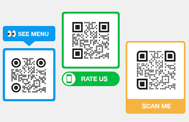
Contrast is the visual engine of a QR code; scanners work by identifying the light-reflecting differences between the dark modules and the light background. The gold standard for reliability is black modules on a white background, which provides a 21:1 contrast ratio. If you choose to use brand colors, you should aim for a contrast ratio of at least 4.5:1. Avoid light-colored modules on dark backgrounds, as many older smartphone cameras and budget scanner apps struggle to process inverted colors.
In addition to color, the “quiet zone” is a mandatory technical requirement defined by ISO/IEC 18004 standards. This is the clear buffer space that surrounds the QR code on all four sides. This margin must be at least four modules wide to prevent surrounding graphics, text, or the edge of the material from interfering with the scanner’s ability to locate the code. For more on achieving the right balance between aesthetics and function, see our guide on QR code color contrast best practices.
Selecting Materials and Finishes for Optimal Results
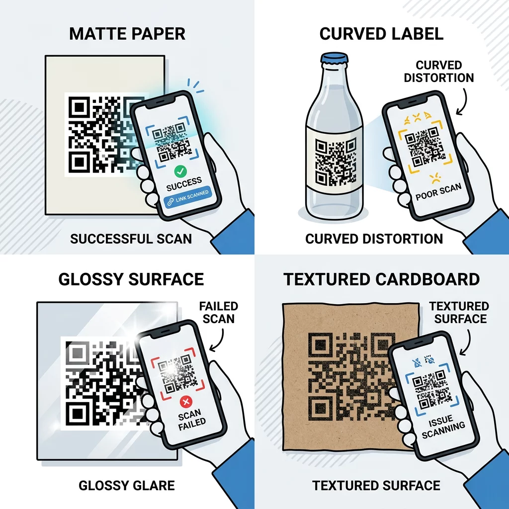
The surface you print on is just as important as the file resolution. Different textures and finishes interact with light in ways that can either help or hinder a smartphone camera. Matte finishes are nearly always superior to glossy ones because they diffuse light rather than reflecting it. Glossy materials, such as certain plastics or metals, often create a “hot spot” of glare that blinds the camera lens and prevents a successful scan.
The substrate also impacts how the ink settles. Paper is generally the most reliable medium, whereas fabric and corrugated cardboard have irregular textures that can distort the modules. If you must print on textured or curved surfaces, such as bottles or apparel, you should increase the physical size of the QR code to compensate for these environmental challenges. You can explore these factors further in our detailed look at how printing techniques impact QR code scannability.
Ready to create a professional, high-resolution code? Use our QR Code Generator to design codes in vector formats like SVG and PDF to ensure your prints remain sharp at any size.
Testing Your Prints Across Devices
Before proceeding with a full print run, you must conduct real-world testing. A code that scans easily on a modern flagship phone in a well-lit office may fail when scanned by an older device in a dim environment or under harsh fluorescent lights.
- Print a single proof on the exact material and at the exact size intended for the final product.
- Test the code with both a high-end QR code scanner and the built-in camera apps of various iOS and Android devices.
- Verify the scan from different angles and under varying light conditions to identify potential glare or shadow issues.
- Ensure the destination link is active and mobile-optimized for the user’s convenience.
Adhering to these ISO/IEC 18004 usability standards ensures that your QR codes are not just decorative elements, but reliable tools for digital engagement.
FAQ
The most reliable formats are vector-based files such as SVG, EPS, or PDF. Because these formats are not made of pixels, they can be scaled up to very large sizes, such as those needed for billboards or banners, without any loss of sharpness or detail.
The finish affects how light reflects off the surface. A matte finish is preferred because it reduces glare, allowing the camera to see the contrast between the modules clearly. A glossy finish can create reflections that obscure parts of the code, leading to scan failures in bright environments.
While some advanced scanners can read codes as small as 1×1 cm, the recommended minimum for general use is 2×2 cm (0.8×0.8 inches). If your code contains a large amount of data or uses high error correction, you should increase the size further to ensure the modules remain distinct.


