
Why are your QR codes being ignored by customers despite being placed in high-traffic areas? When a code is difficult to scan or poorly positioned, users quickly lose interest, and your marketing ROI suffers. This guide explains how to optimize placement and design to ensure every code provides a seamless digital connection.
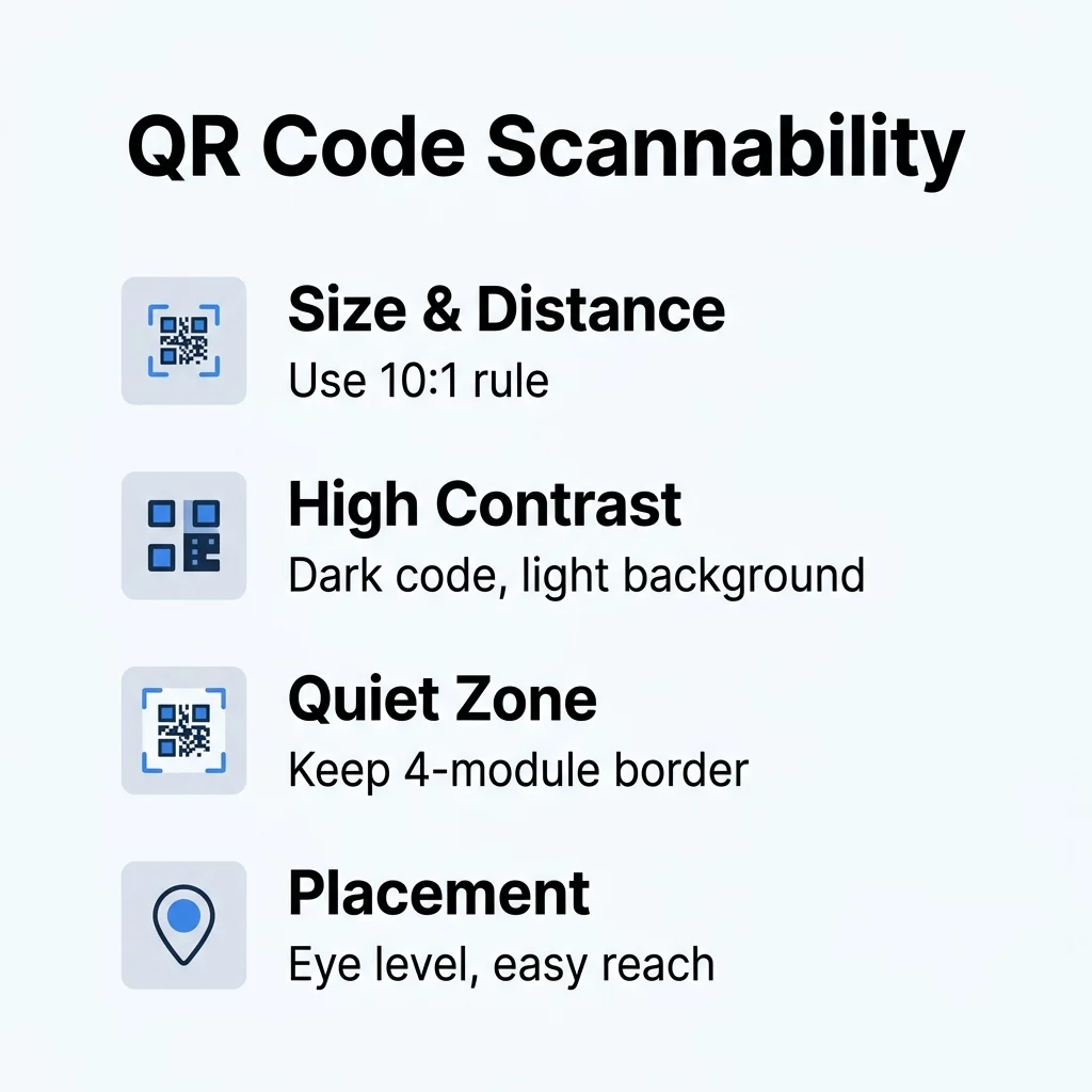
Establishing Proper Sizing and Scan Distance
The most frequent reason for scan failure is a code that is too small for the distance from which it is being viewed. To ensure a smooth user experience, you should follow the 10:1 ratio, which suggests that for every 10 inches of distance between the user and the code, the QR code should be at least 1 inch wide. For close-up items like business cards or brochures, the minimum physical size should be at least 0.8 x 0.8 inches (2 x 2 cm) to ensure modern smartphone cameras can focus correctly.
If your code contains a large amount of data, such as a vCard with multiple contact fields, the individual modules – the small squares within the grid – become smaller and more crowded. This density makes it harder for a scanner to resolve the pattern. To combat this, you can use dynamic QR codes to keep your designs clean. Because dynamic codes only embed a short redirect URL rather than the full data payload, the pattern remains simple and easy to scan even at smaller sizes.
Why Contrast and Color Choice Define Readability
Scanners identify QR codes by detecting the difference in light reflected between the dark modules and the light background. If the contrast is too low, the scanner cannot “see” the pattern, similar to how a person might struggle to read light gray text on a white page. Always prioritize a dark foreground on a light background, aiming for a minimum contrast ratio of 4.5:1 for small codes. While black on white is the gold standard for reliability, other high-contrast combinations like navy blue on beige also perform well.
Beyond the colors themselves, the application of those colors matters. Using shadows or gradients within the code can confuse the scanner’s edge-detection logic by creating mid-tones that the software cannot categorize as either “light” or “dark.” To maintain high readability, stick to solid colors. Testing your contrast and color choice under the actual lighting conditions of the deployment is essential, as harsh shadows or dim environments can effectively lower the visible contrast of an otherwise well-designed code.
Avoiding Common Design and Technical Errors
Even a perfectly sized code can fail if the design interferes with the technical requirements of the QR standard. One of the most common oversights is encroaching on the quiet zone, which is the empty border surrounding the code. According to ISO/IEC 18004 standards, this zone must be at least four modules wide on all sides. This buffer acts like a frame, telling the scanner exactly where the data starts and ends.
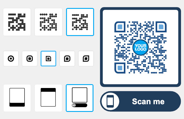
While adding a logo is an excellent way to boost brand recognition, it should never cover more than 25% to 30% of the code area. Overusing logos or placing them over critical finder patterns can overwhelm the error correction capabilities. Similarly, busy backgrounds can be problematic; placing a QR code directly over a photograph or a textured pattern can cause the scanner to misinterpret the background as part of the data. Always use a solid-colored “landing pad” behind your code to ensure it stands out clearly from the rest of your marketing material.
Try the Pageloot QR Code Generator Need a code that looks professional and scans every time? Create your first dynamic QR code with Pageloot to access built-in scannability checks and advanced customization features.
Strategic Placement for Maximum Engagement
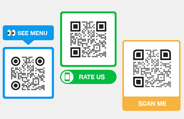
Where you place your code is just as important as how it looks, as you need to capture the user’s attention at the moment they are most likely to interact. For posters, flyers, and storefront windows, place the QR code at eye level, typically between 3.5 and 5.5 feet. This positioning feels natural for a user holding a smartphone and prevents the need for uncomfortable reaching or crouching.
The effectiveness of placement across different media is often dictated by the specific context of the material:
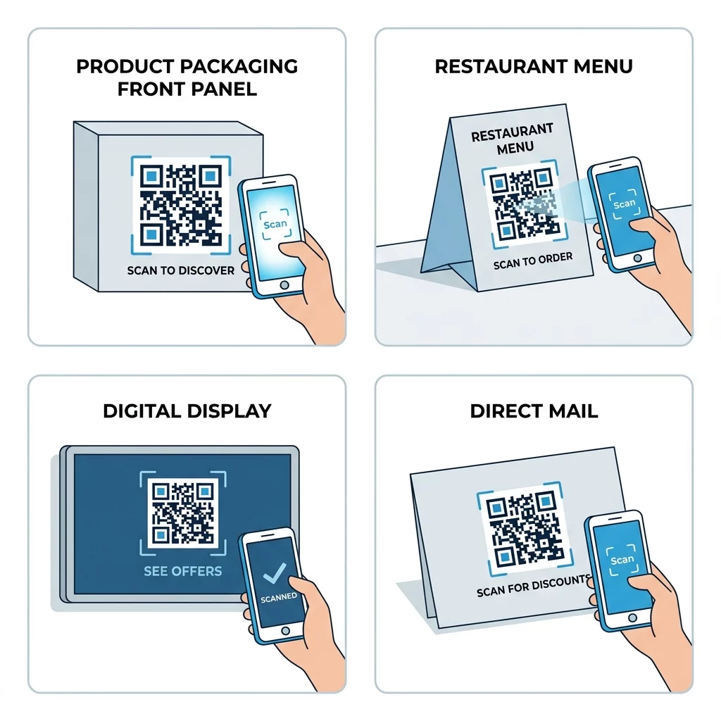
- Product Packaging: Research indicates that placing QR codes on the front panel results in a 121% increase in scans compared to those hidden on the back or bottom.
- Restaurant Tables: Codes should be placed on table tents or coasters where they are easily reachable but do not interfere with the dining experience.
- Digital Screens: When displaying codes on TVs or kiosks, ensure the code is at least 240 pixels wide and remains on screen for 10 to 15 seconds to allow the user time to open their camera app.
- Direct Mail: Placing a code on the front panel or the back flap ensures it is one of the first things a recipient sees when opening the mailer.
Environmental Factors and Material Selection
The physical material your code is printed on can drastically affect performance due to light reflection and surface geometry. Glossy laminates and glass storefronts create reflections that “wash out” the code’s contrast, making matte finishes the preferred choice for most signage. If you must use a glossy surface, test the code from multiple angles to ensure glare does not block the scanner’s view.
| Material | Minimum Size | Durability | Best Use Case |
|---|---|---|---|
| Paper | 0.4 inches | Low | Flyers, brochures, business cards |
| Cardboard | 0.6 inches | Medium | Shipping boxes, shelf displays |
| Fabric | 0.8 inches | High | Apparel, banners, tote bags |
Surface texture and shape also play a role. Placing a code on a sharp curve, such as a small bottle, can distort the modules and prevent the camera from focusing on a flat plane. For these scenarios, using a higher level of error correction – specifically Level Q or H – is advisable. These data limits and error correction settings allow the code to remain functional even if up to 30% of its surface is obscured by damage, dirt, or environmental distortion.
By combining thoughtful design with strategic placement, you transform a simple digital shortcut into a high-performing marketing tool. Always test your final product on both iOS and Android devices in the actual environment where it will be used to ensure your audience enjoys a friction-free experience.
Frequently Asked Questions
While a QR code can technically be as small as 0.4 x 0.4 inches, the practical minimum for reliable scanning on marketing materials is 0.8 x 0.8 inches. Anything smaller risks failure on older devices or in sub-optimal lighting conditions.
Yes, you can use custom colors as long as you maintain a high contrast ratio. Dark blue, green, or red on a white or light yellow background typically works well, but you should avoid using light colors for the modules themselves.
To improve scanning on curves, you can reduce the size of the code so it sits on a flatter portion of the surface. Alternatively, using a dynamic QR code keeps the module density low, which makes the code more resilient to the geometric distortion caused by the curve.
Ready to connect your physical marketing to digital insights? Start your free trial with Pageloot and manage all your dynamic QR codes from one centralized dashboard.


