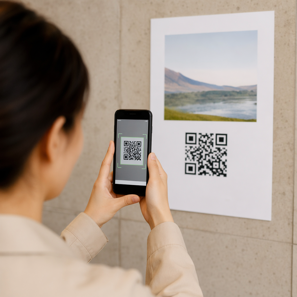
Are you struggling to make your digital touchpoints look professional and trustworthy? Standard black-and-white squares often feel like an afterthought, causing users to hesitate before scanning your materials. By learning how to design a custom branded QR code, you can bridge the gap between physical marketing and digital content while reinforcing your brand identity.
Why Branding Matters for Scan Performance
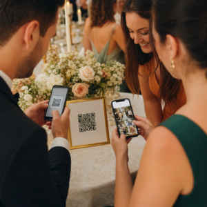
Branding your QR code is not just about aesthetics; it is a strategic move to build trust and recognition. Research indicates that branded QR codes featuring logos can boost scan rates by 30% to 70% compared to generic designs. When a customer sees your logo inside the code, they immediately associate the content with your brand, which reduces security concerns and increases the likelihood of engagement.
Major global brands have already successfully integrated these visual elements into their campaigns. For instance, Coca-Cola has utilized signature red and silver color schemes on its packaging, while Starbucks uses its recognizable green and white palette on menus and signage. These customizations ensure the QR code feels like a native part of the design rather than a disruptive technical element.
Designing with Brand Colors and Shapes
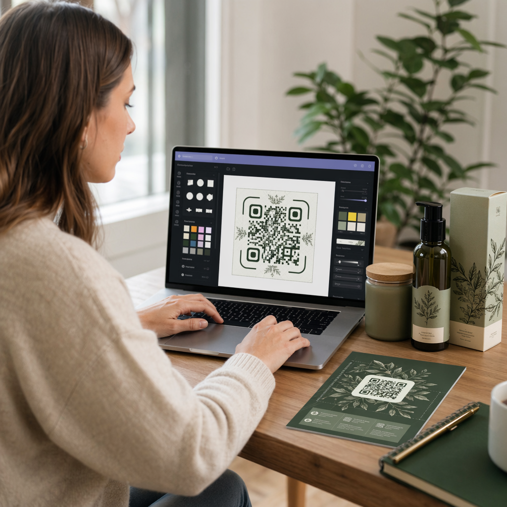
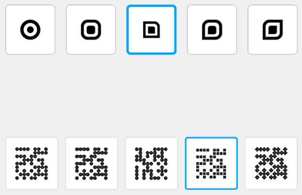
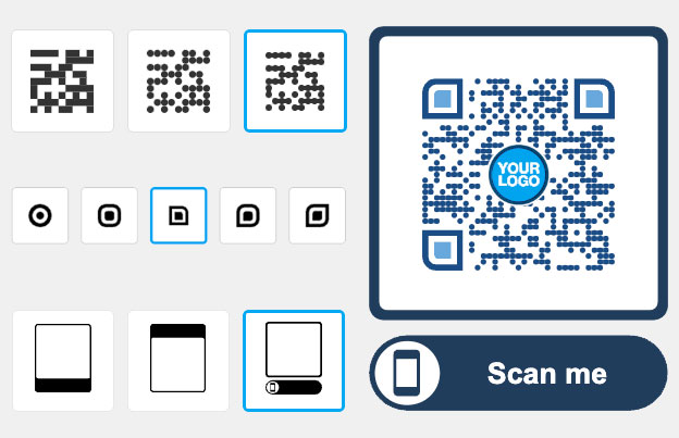
Customization allows you to move beyond the boxy, traditional look by modifying the body, edges, and frames of the code. Using a QR code generator with logo gives you control over the “ball” type and “edge” frames, which can be adjusted to match your brand’s unique visual style. You can even choose non-square shapes, such as circles or hearts, to make the code stand out on creative layouts like posters or clothing.
Selecting High-Contrast Colors
While you should align the code with your brand colors, maintaining QR code color contrast is the foundation of scannability. Scanners rely on the ability to distinguish between the foreground and background; therefore, you should always favor dark patterns on light backgrounds. For example, navy blue on a beige background provides an excellent contrast ratio of 15:1, whereas light gray on white (2:1) will likely fail to scan.
To ensure your design remains functional, aim for a minimum contrast ratio of 4.5:1. Think of the scanner like a high-speed reader that needs sharp definition to “see” the data modules. Avoid using gradients or shadows within the code itself, as these can create mid-tones that confuse the scanning software.
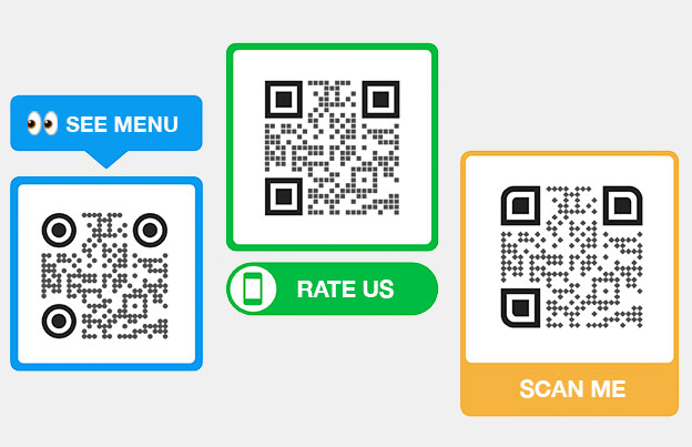
Using Custom Frames and CTAs
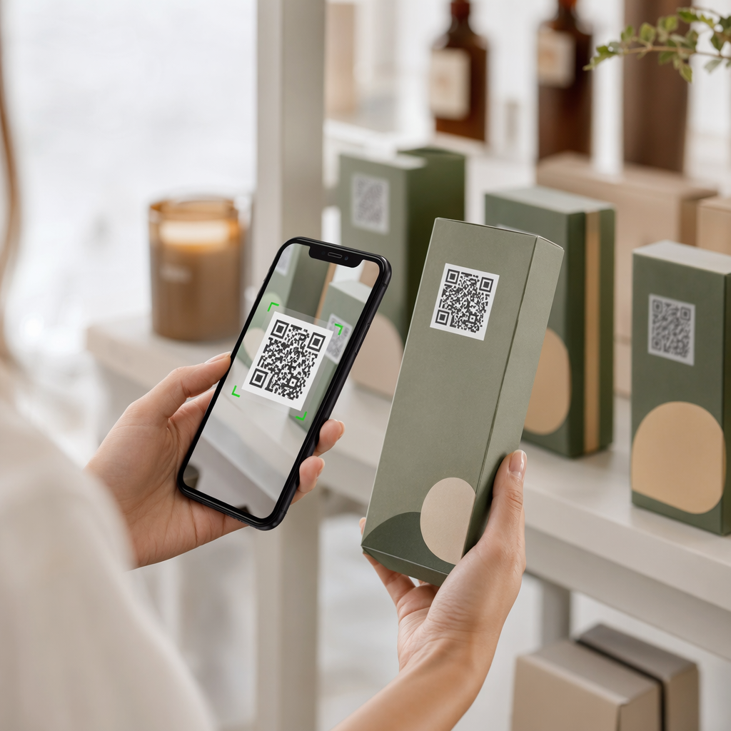
Adding a frame around your QR code provides a dedicated space for a call-to-action (CTA). A clear phrase like “Scan to view menu” or “Scan for 20% off” tells the user exactly what to expect, significantly improving interaction rates. These frames also help define the code’s boundary, ensuring it doesn’t get lost among other design elements on a busy flyer or product label.
Integrating Your Logo Safely
Adding a logo is one of the most effective ways to personalize your code, but it requires careful placement to avoid breaking the functionality. When adding logos to QR codes, you should always place the image in the center of the code. This is because the center of the QR code is generally more forgiving than the corners, which contain critical position markers that the scanner uses to orient itself.
For the best results, keep your logo coverage to 30% or less of the total code area. Using a simple, high-resolution PNG or SVG file ensures that the logo remains crisp even when printed at smaller sizes. If the logo is too large or complex, it may obscure too many data modules, making the code unreadable.
Create Your Branded QR Code Today Ready to turn your generic codes into powerful branding assets? Use our QR code generator with logo to customize colors, add your brand mark, and download high-resolution files for your next campaign.
Technical Standards for Reliable Scanning
A professional design must be backed by technical precision to work across all devices. Even the most beautiful QR code is useless if it cannot be scanned by an older smartphone or in poor lighting. Following established QR code design tips ensures your customization does not come at the cost of performance.
Managing the Quiet Zone and Error Correction
The “quiet zone” is the blank margin surrounding the QR code that separates it from other text or graphics. This space should be at least four modules wide on all sides. For example, if a single module in your code is 2 mm wide, your quiet zone should be at least 8 mm of clear, unprinted space. Without this buffer, a scanner may struggle to identify where the code begins and ends.
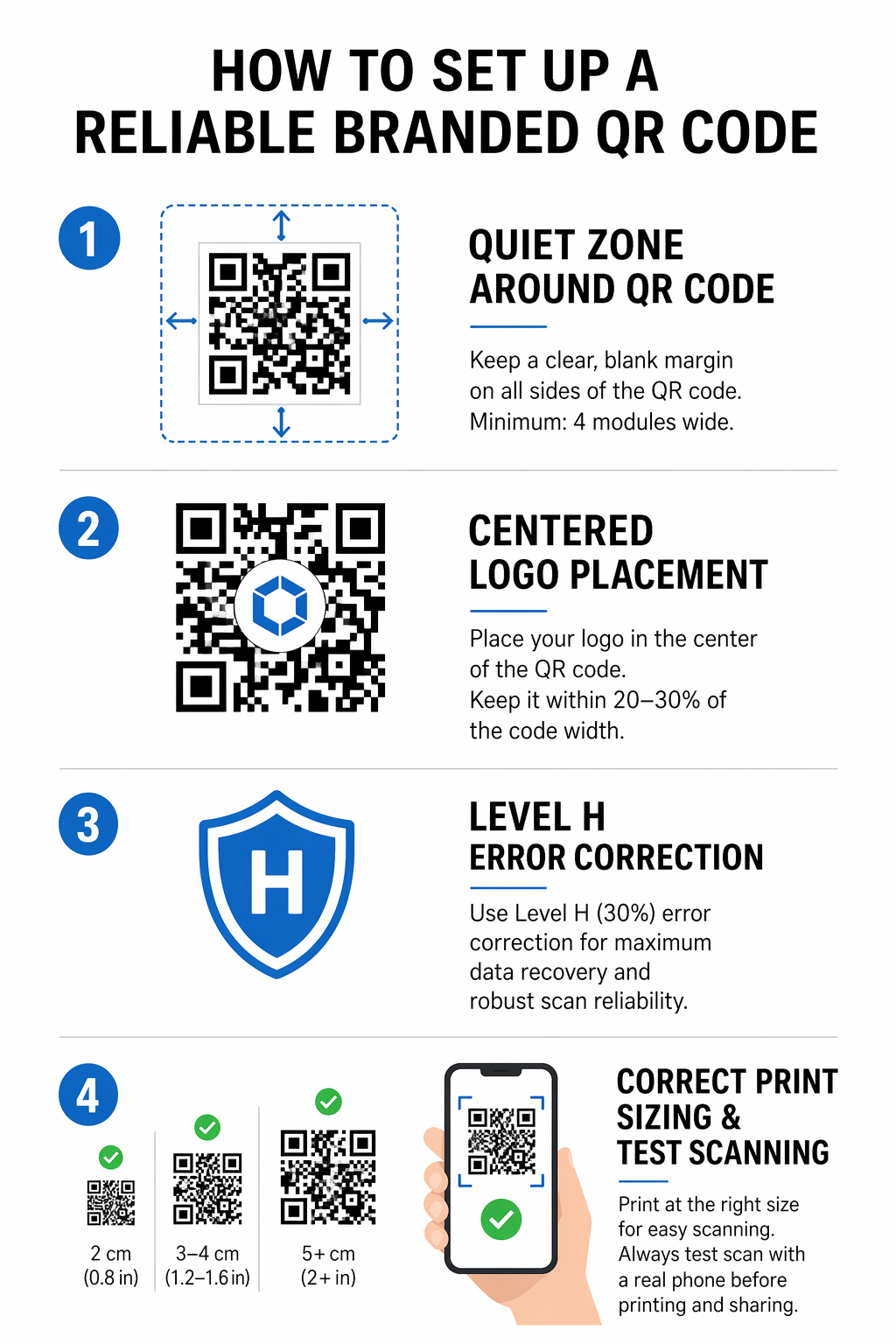
To compensate for design overlays like logos, you must use a higher level of error correction. Reed-Solomon error correction adds redundant data to the code, allowing it to remain scannable even if part of it is covered or damaged. When branding your code, select Level H (which allows for up to 30% damage) to ensure maximum reliability.
Proper Sizing for Different Environments
Size is a critical factor in best practices for QR code readability. For close-range use, such as on a business card or product tag, a QR code should be at least 0.8 x 0.8 inches (2 x 2 cm). As the scanning distance increases, the code size must increase proportionally. A helpful rule of thumb is a 10:1 ratio; if a user is scanning from 10 feet away, the code should be at least 1 foot wide.
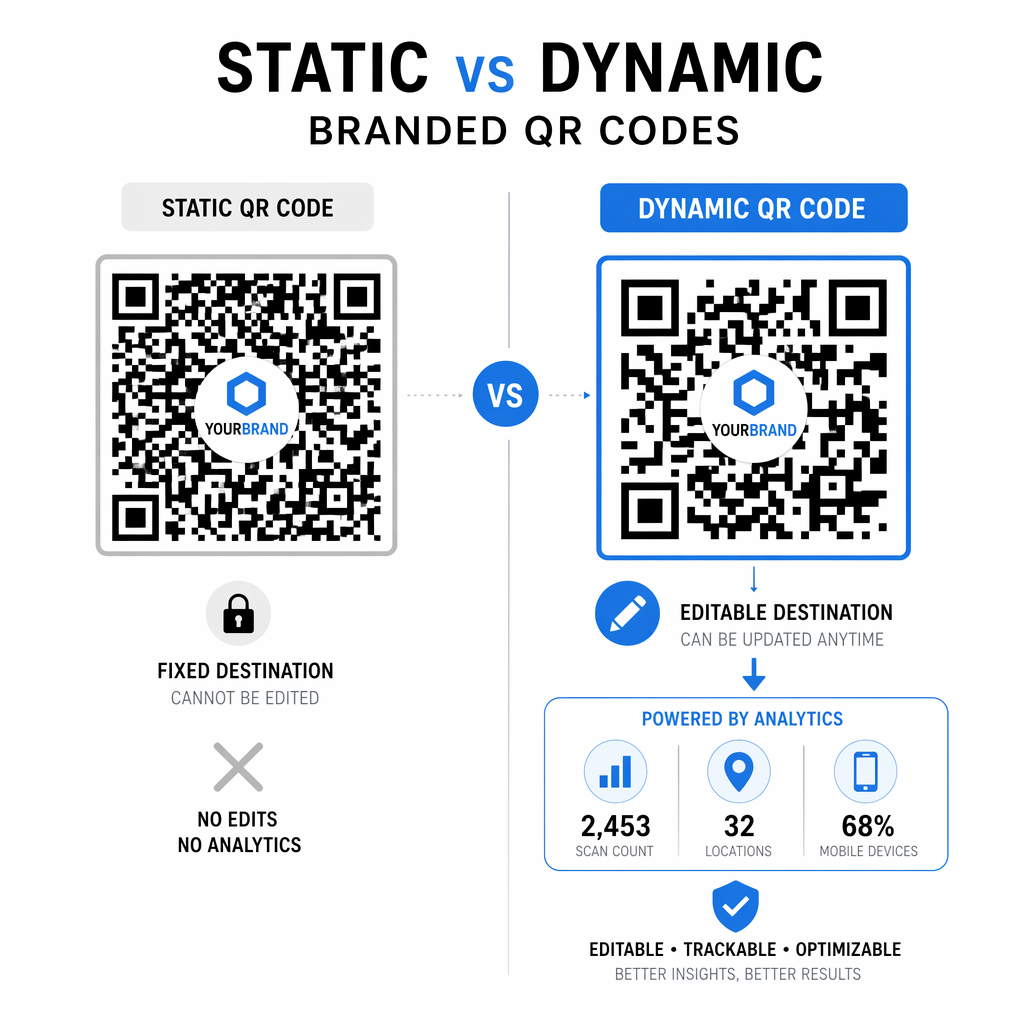
Static vs. Dynamic QR Codes for Brands
Before finalizing your design, you must choose between static and dynamic QR codes. Static codes encode data directly into the pattern, meaning the destination link can never be changed, and the design becomes denser as you add more information. This can make them harder to scan if you are trying to encode a long URL.
Dynamic QR codes are the preferred choice for professional marketing because they use a short redirect URL. This keeps the code design clean and fast-scanning, regardless of how much data is behind the link. More importantly, dynamic codes allow you to update the destination content at any time without reprinting your materials. They also provide detailed analytics, such as scan counts, locations, and device types, which are essential for measuring the ROI of your branded campaigns.
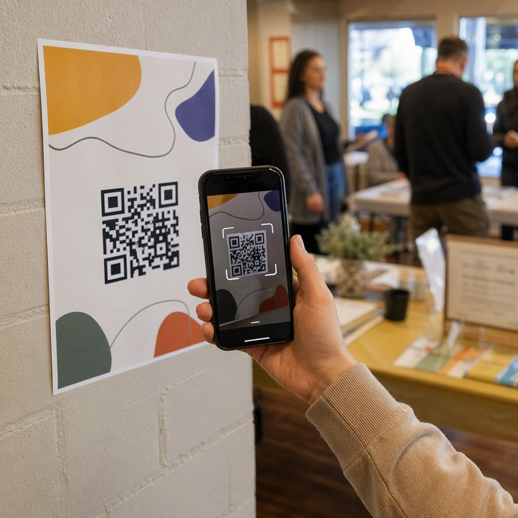
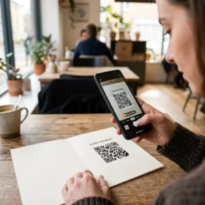
To ensure your custom design works perfectly, always perform a test scan using a QR code scanner on multiple devices under different lighting conditions. This final check confirms that your colors, logo placement, and sizing are optimized for the real world.
Frequently Asked Questions
No, the colors are part of the printed design. However, if you use a dynamic QR code, you can change the destination URL or the content it points to at any time without needing to change the physical code.
It can if not done correctly. To prevent scanning issues, use the highest error correction level (Level H), keep the logo centered, and ensure it covers no more than 30% of the code’s surface area.
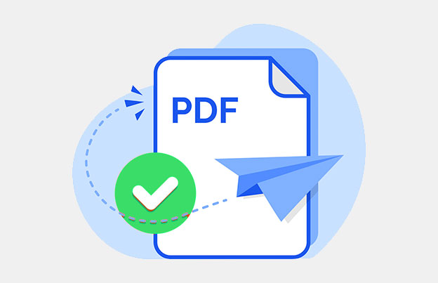
For high-quality printing, you should use vector formats like SVG, EPS, or PDF. These formats allow you to scale the QR code to any size without losing sharpness or scannability, which is vital for large-scale marketing materials.


