Is your custom QR code failing to scan despite looking sharp on your screen? Weak color contrast and poor palette choices can make codes invisible to camera sensors, losing valuable customer engagement. This guide outlines practical contrast rules and testing methods to guarantee your QR codes scan reliably across every device.
Why Contrast Controls QR Code Scannability
Optical sensors read QR codes by measuring reflectance differences between dark and light modules. The international standard for QR codes, ISO/IEC 18004, is built on the concept of dark modules set against a light background. When an optical scanner sweeps a code, the dark modules absorb light while the light background reflects it. If this difference in reflectance is too narrow, the decoding algorithm cannot distinguish the data pattern from the surrounding space.
In technical barcode evaluation, symbol contrast measures the difference between the brightest reflectance value and the darkest reflectance value. Scanners also evaluate modulation, which tracks how uniformly those light and dark modules reflect illumination across the entire symbol. If your colors shift unevenly or lack separation, the scanner fails to identify module boundaries.
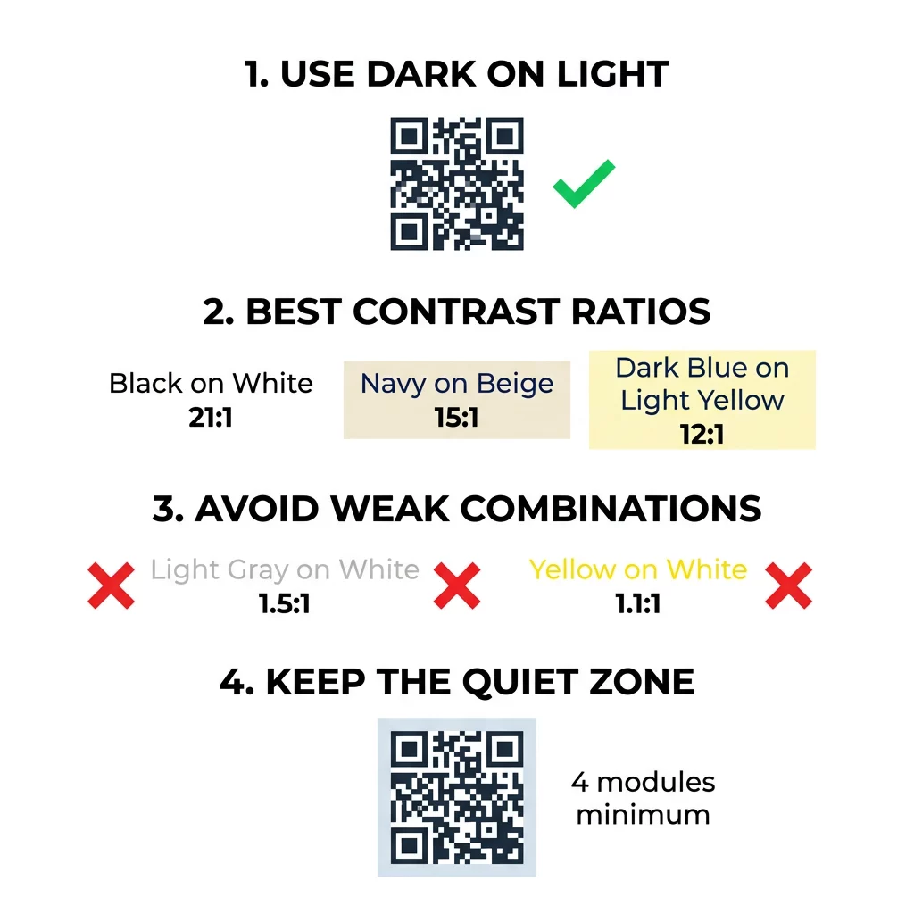
Sticking with normal polarity – dark foreground modules on a light background – remains essential for broad compatibility. While specialized reader apps can invert colors digitally, many built-in smartphone camera utilities cannot read light codes on dark backgrounds. Designing a dark pattern over a light base ensures that every device decodes your information immediately.
Evaluating Color Contrast Ratios and Thresholds
Designers often rely on accessibility metrics to evaluate visual clarity before printing. While the Web Content Accessibility Guidelines establish contrast ratios specifically for readable text, applying these relative-luminance measurements provides an effective baseline for QR code design. To learn more about inclusive visual principles, you can review our guide on how to make QR codes ADA compliant.
A practical design target is a contrast ratio of at least 4:1 to 4.5:1 between the pattern and background. However, challenging lighting environments demand even greater separation. Standard black modules on a pure white background yield a maximum contrast ratio of 21:1, offering the highest scanning reliability under any condition. Selecting deep, saturated shades on crisp, light tones ensures the sensor registers distinct module edges.
| 颜色组合 | Approximate Contrast Ratio | Scannability Assessment |
|---|---|---|
| 黑色在白色上 | 21:1 | Optimal (Industry Standard) |
| 海军蓝在米色上 | ~15:1 | 优秀 |
| 深蓝色在浅黄色上 | ~12:1 | 很好 |
| Dark Brown on Off-White | ~8:1 | Good |
| 红色在白色上 | ~5:1 | Moderate (Requires Testing) |
| 浅灰色配白色 | ~1.5:1 | Poor (Frequent Scan Failures) |
| 黄色配白色 | ~1.1:1 | 无法扫描 |
Customize Codes Without Sacrificing Scannability Test colors and preview your design in real time using our 带标志的二维码生成器 to balance brand aesthetics with reliable scanning.
Safeguarding the Quiet Zone and Code Dimensions
High contrast must extend beyond the internal modules to the outer boundary of the code. The blank margin encircling the pattern is known as the quiet zone, and it signals to the camera where the code begins and external design elements end.
- Maintain a quiet zone at least four module widths wide on all four sides of the code.
- Keep this surrounding margin completely clear of text, illustrations, and design borders.
- Match the quiet zone color to your light background color so the boundary stays seamless.
- Size printed codes to at least 2 x 2 cm (0.8 x 0.8 inches) for standard handheld distances.
- Expand the overall physical dimensions when encoding dense information or longer web links.
Encroaching on this buffer area is a frequent cause of scan errors in branded collateral. Exploring 二维码可读性的最佳实践 helps ensure your layout preserves these structural margins while accommodating your artwork.
Avoiding Common Color and Styling Mistakes
Customizing code aesthetics can easily disrupt optical readability if certain design pitfalls occur. Camera sensors convert images into grayscale to calculate module thresholds, meaning two distinct color hues might share the exact same brightness value when processed.
- Avoid using red or orange shades for dark modules, as optical sensors often treat warm wavelengths as reflective rather than light-absorbing.
- Avoid soft pastel shades like baby blue, mint, or pale yellow for your primary data pattern.
- Avoid multicolor gradients across the data grid, which create uneven modulation and confuse edge detection.
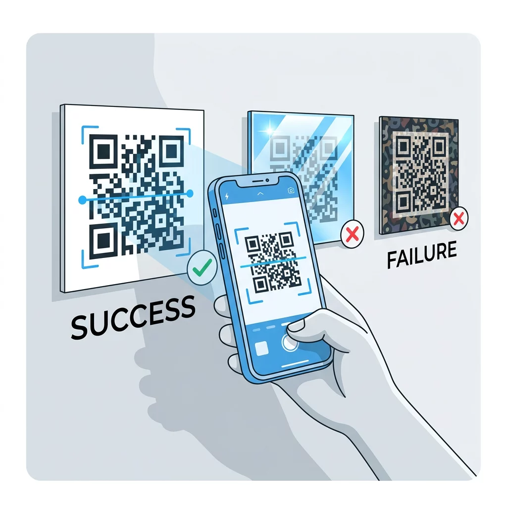
- Avoid transparent backgrounds placed over complex photography, textured paper, or patterned packaging.
- Avoid reverse-contrast designs that place white or light elements across a dark backdrop.
Understanding the technical boundaries of decorative elements allows you to explore 如何创建自定义QR码 that showcases your visual identity without breaking decoding rules.
Testing and Validating Across Real-World Environments
A design that scans instantly on an illuminated computer display can easily fail when produced on physical media. Ambient lighting conditions, viewing angles, and material textures alter the effective contrast reaching the camera lens.
Direct sunlight can wash out subtle color differences, while dim indoor illumination reduces the sensor’s ability to separate modules from the background. Highly reflective finishes produce glare that conceals parts of the data grid. Using matte paper stock or non-reflective substrates prevents specular reflections and preserves optical clarity.
Always verify your artwork on physical proofs before committing to large print runs. Reviewing the steps on how to test a QR code before printing ensures that your layout holds up under actual production parameters. Evaluate the printed asset across multiple smartphone models, testing both modern and older lenses, as well as native camera utilities and a browser-based QR码扫描仪. If recognition hesitates, apply practical methods on how to improve QR code readability by refining sizing, error correction levels, or background separation.
Maximizing QR Code Reliability and Engagement
Achieving high scan rates requires treating color contrast as a foundational technical requirement rather than an aesthetic afterthought. Choosing a high-contrast palette, respecting the quiet zone, and validating printed proofs under varied lighting conditions protects your marketing investment from scanning failures.
Build your next high-contrast design using our 二维码生成器 to create polished, fully compliant codes that deliver effortless scanning for every customer.
常见问题
Designers should target a contrast ratio of at least 4:1 to 4.5:1 between the modules and background, with higher ratios like 12:1 providing greater reliability in challenging lighting conditions.
Yes, as long as your brand color is sufficiently dark – such as deep navy, forest green, or charcoal – and sits against a uniform, light background.
International QR code standards specify dark modules on a light background as normal polarity, meaning many native camera apps cannot detect light modules placed on dark backgrounds.