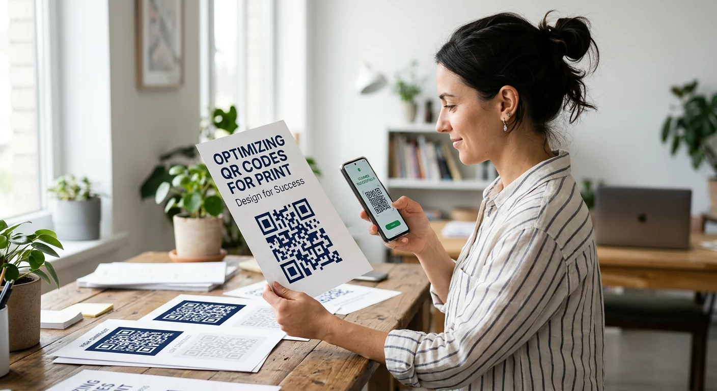
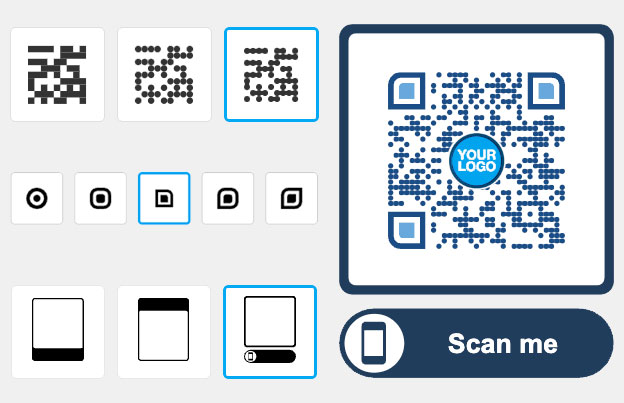
デザインレイアウトでは見栄えが良いのに、カスタムQRコードがスキャンできないとお困りですか?コントラストが低い、または色の選択が不適切だと、コードがスマートフォンのカメラに認識されず、エンゲージメントの喪失やユーザーの不満につながる可能性があります。このガイドでは、高コントラストの色を選択し、アクセシビリティ基準に従って、あらゆるデバイスや照明条件下でコードがスキャン可能であることを保証する方法を説明します。.
コントラストがスキャン可能性の基盤である理由
ISO/IEC 18004として知られるQRコードの技術標準では、スキャナーは暗いモジュールと明るいモジュールの反射率の違いを検出することでコードを識別すると規定されています。スキャナーを、情報と空白を区別するために鮮明なエッジを必要とする高速リーダーのように考えてください。コードの「暗い」部分は光を吸収し、「明るい」部分は光を反射する必要があります。これら2つの違いが十分に鮮明でない場合、スキャナーはデータパターンを背景から区別できません。.
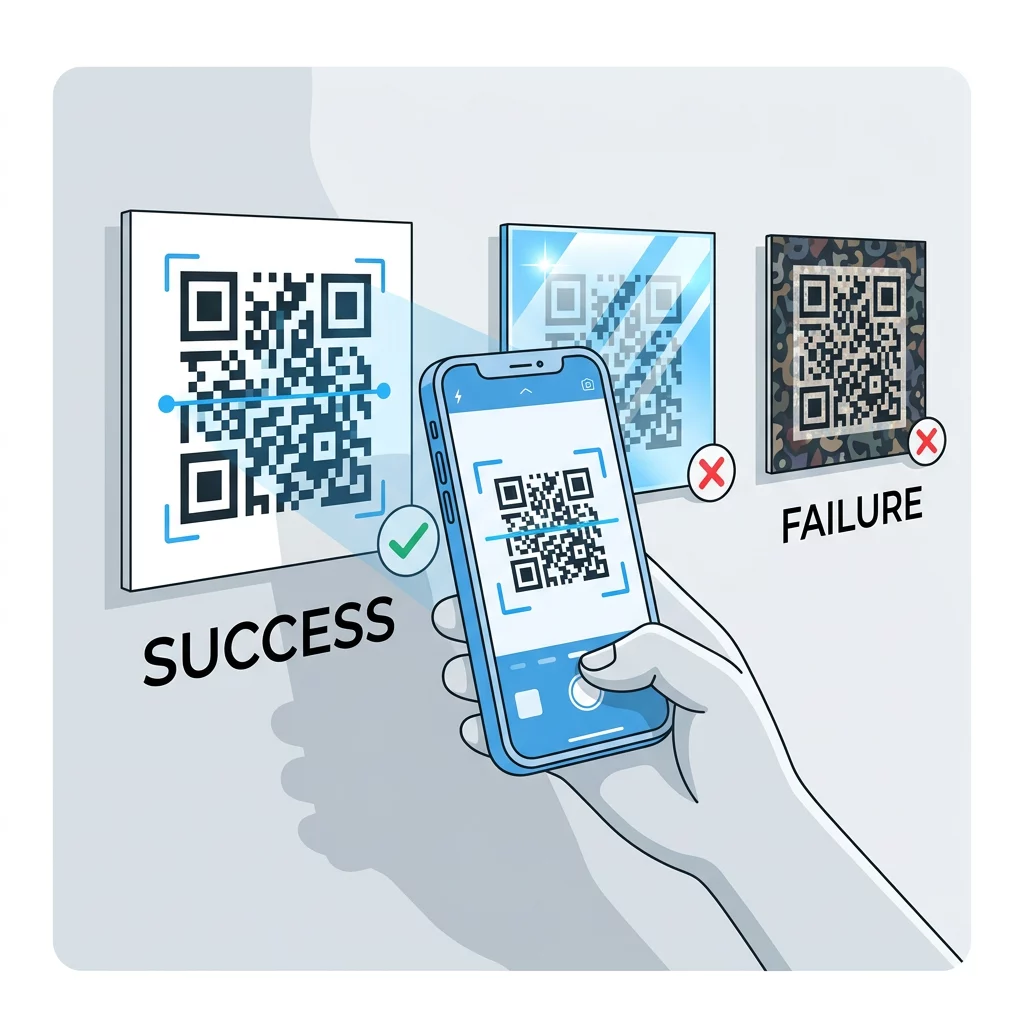
QRコードでは、暗いモジュールは常にデータとして解釈されます。このため、常に明るい背景に暗い前景を目指すべきです。黒い背景に白いモジュールのような反転コードを読み取れる高度なアプリもありますが、多くのデフォルトのカメラアプリや古いデバイスでは、それらをまったく認識できません。暗い色を明るい色の上に配置する構成に固執することで、コードが可能な限り幅広いユーザーに対して機能し続けることが保証されます。.
ブランドのQRコードが機能し続けるようにするには、 ロゴ付きQRコードジェネレーター さまざまな色の組み合わせをテストし、リアルタイムで結果を確認できる.
WCAG基準と推奨コントラスト比
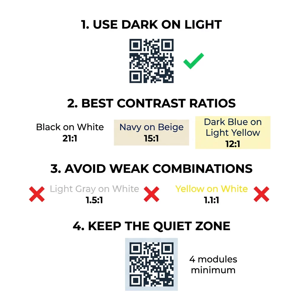
QRコードがすべての人にとってアクセス可能であることを保証するには、ウェブコンテンツアクセシビリティガイドライン(WCAG)に従う必要があります。高コントラストは、視覚障害を持つ世界中の何百万人ものユーザーにとって特に重要です。WCAG 2.1は主にテキストに焦点を当てていますが、同じ原則がQRコードのモジュールにも適用されます。標準的な可読性には最低4.5:1のコントラスト比が必要ですが、屋外や低照度環境での最大の信頼性のためには、12:1以上の比率が推奨されます。.
| 色の組み合わせ | コントラスト比 | スキャン可能性評価 |
|---|---|---|
| 白地に黒 | 21:1 | 優れている(ゴールドスタンダード) |
| ベージュ地にネイビーブルー | ~15:1 | 素晴らしい |
| 薄い黄色地に濃い青 | ~12:1 | 非常に良い |
| 白地に赤 | ~5:1 | 良好(テストが必要) |
| 白地にライトグレー | ~1.5:1 | 不良(スキャンできないことが多い) |
| 白地に黄色 | ~1.1:1 | スキャン不可 |
白い背景にネイビーブルーやチャコールグレーのような高コントラストの組み合わせは、カメラがコードを素早く認識するために十分な「視覚的ノイズ」の分離を提供します。逆に、パステルカラーや薄い灰色を使用すると、人間の目にはエレガントに見えるものの、デジタルセンサーには認識されないコードになることがよくあります。.
アクセシビリティとクワイエットゾーンのためのデザイン
高コントラストは、コード内の色だけでなく、その周囲のスペースも含まれます。この不可欠な境界はクワイエットゾーンとして知られています。これは、デザイン環境がどこで終わり、QRデータがどこから始まるかをスキャナーに伝えるバッファとして機能します。.
- クワイエットゾーンは、コードの全周にわたって少なくとも4モジュール幅でなければなりません。.
- この境界は、スキャナーがコードを分離するのを助けるために、単色で明るい色、理想的には背景と一致する色でなければなりません。.
- 印刷物の場合、近距離でのスキャン可能性を維持するために、コードは少なくとも1 x 1インチ(2.5 x 2.5 cm)であるべきです。.
- より多くのデータを持つ高密度なコードは、各モジュールが明確であることを保証するために、より大きな寸法を必要とします。.
次の ユーザーフレンドリーなQRコードを設計するためのチェックリスト は、テキストやグラフィックでクワイエットゾーンを侵害してスキャン失敗につながるなどの一般的な落とし穴を避けるのに役立ちます。.
避けるべきよくある色とデザインの誤り
When customizing a code for your brand, it is tempting to use gradients or brand-specific hues. However, certain aesthetic choices can compromise the integrity of the data. For example, many mobile sensors have difficulty “seeing” red and orange wavelengths as dark modules. This can cause the code to “disappear” when viewed through a camera lens, especially in warm lighting.
Gradients and shadows are another frequent source of error because they distort the edges of the modules. For the most reliable results, you should stick to solid, uniform colors for the data pattern. Transparent backgrounds also pose a risk; if you place a QR code with a transparent background on a busy or dark image, the contrast will fluctuate across the code, making it impossible for the software to decode the pattern.
Ready to create a high-performance code that matches your brand? Use our QRコードジェネレーター to build a customized, high-contrast design that follows these technical standards.
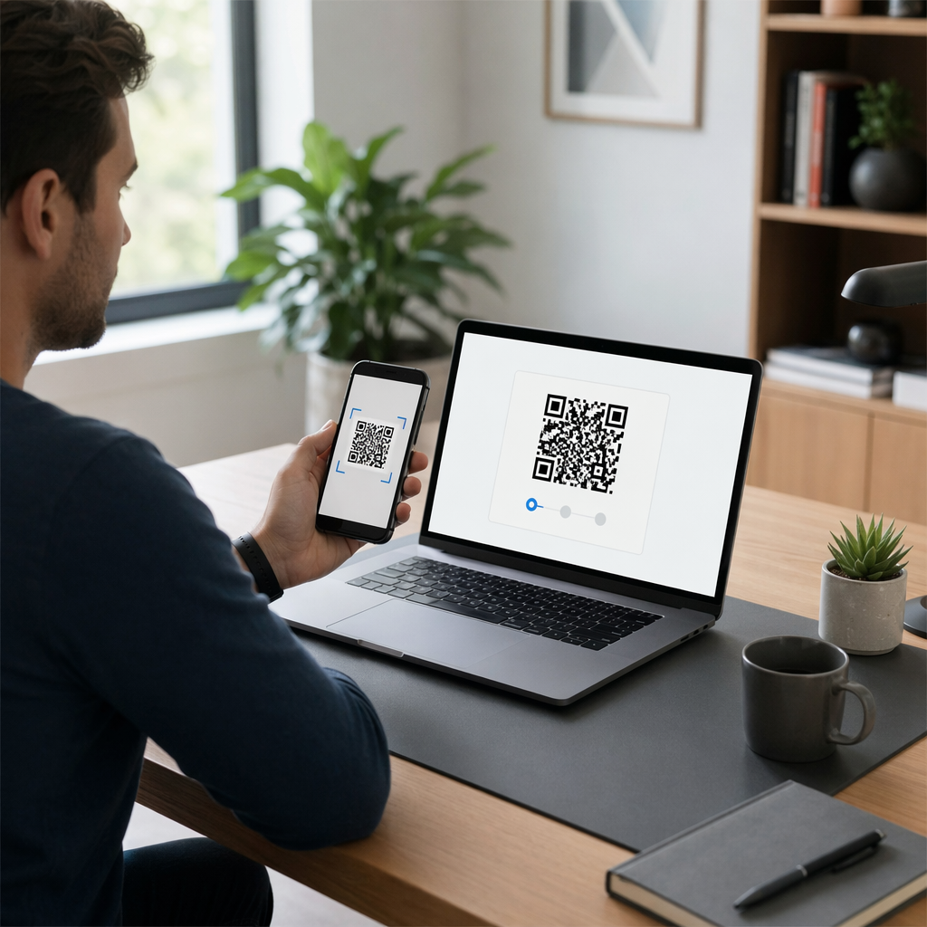
Testing Under Real-World Conditions
A design that scans perfectly on a high-resolution monitor might fail when printed on a glossy poster or displayed in a dim hallway. You must validate your work by testing in different scenarios to account for glare, shadows, and hardware variations. Matte finishes are generally superior to glossy ones because they prevent light reflections from obscuring the modules, which is a common issue with outdoor signage or window stickers.
When evaluating your design, you should use both the latest smartphone models and older devices to ensure the contrast is sufficient for lower-quality cameras. Testing from various angles and distances is also vital, as the effective contrast can drop when a user scans the code from the side. For more advanced branding strategies, you can review these QRコードデザインのヒント to learn how to balance visual appeal with technical functionality. If you find your code is still struggling, focusing on QRコードの読み取りやすさを向上させるための一般的なルールは、 through size adjustments and error correction levels can resolve most issues.
よくある質問
While the absolute technical minimum for some scanners is 3:1, you should aim for at least 4.5:1 to meet standard accessibility requirements. For guaranteed reliability across all devices and lighting conditions, a ratio of 12:1 or higher is the safest choice.
Yes, as long as your brand color is sufficiently dark – such as navy, burgundy, or forest green – and the background is a contrasting light shade like white or cream. Always avoid using light brand colors like yellow or sky blue for the foreground modules.
Most scanning algorithms are specifically programmed to look for dark modules on a light background. While some modern apps can digitally “flip” the colors to read an inverted code, many native camera apps do not have this feature, resulting in a failure to recognize the code. To ensure your marketing campaign is a success, always prioritize functionality over aesthetics. High-contrast, well-sized QR codes provide a seamless experience for your users, regardless of their device or environment. If you need to maintain flexibility after your materials are printed, consider using best practices for QR code readability by opting for dynamic codes that allow you to update the destination link without changing the physical design.


