Are your physical marketing materials failing to drive traffic to your digital content? Generic black-and-white QR codes often blend into background visual noise, resulting in missed customer interactions and wasted campaign budgets. By applying strategic color contrast, custom branding, clear calls to action, and dynamic tracking, you can transform plain codes into high-converting visual assets.
Prioritize Scannability with High Color Contrast
Visual design should never compromise functional scannability. Camera sensors decode QR patterns by measuring the light reflection contrast between foreground modules and background surfaces. Darker shades absorb light while lighter shades reflect it, allowing optical lenses to read embedded data points clearly.
To maintain maximum readability across varying lighting conditions, apply established QR code color contrast guidelines:
- Maintain dark foregrounds on light backgrounds: Select solid, dark pattern colors such as navy, charcoal, or dark burgundy on clean, light backgrounds. Standard black on white delivers an optimal 21:1 contrast ratio.
- Meet standard contrast ratio requirements: Maintain a minimum contrast ratio of 4.5:1 for small printed materials and at least 3:1 for larger signage displays.
- Avoid internal gradients and drop shadows: Skip multi-toned gradients and soft drop shadows, as mid-tone shades create visual noise that confuses optical sensors.
- Skip color inversion designs: Avoid using light patterns on dark backgrounds, as reversed designs fail on many native smartphone camera scanners.
Integrate Your Brand Logo Without Sacrificing Readability
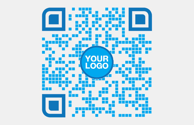
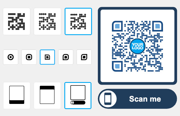
Placing a company logo inside a QR matrix builds instant brand recognition and reassures users that the destination URL is legitimate. Reviewing real-world examples of branded QR codes demonstrates that custom designs generate higher user engagement than plain monochrome boxes.
When learning hvordan man tilføjer logoer til QR-koder, protect critical scanner detection zones to keep your code readable:
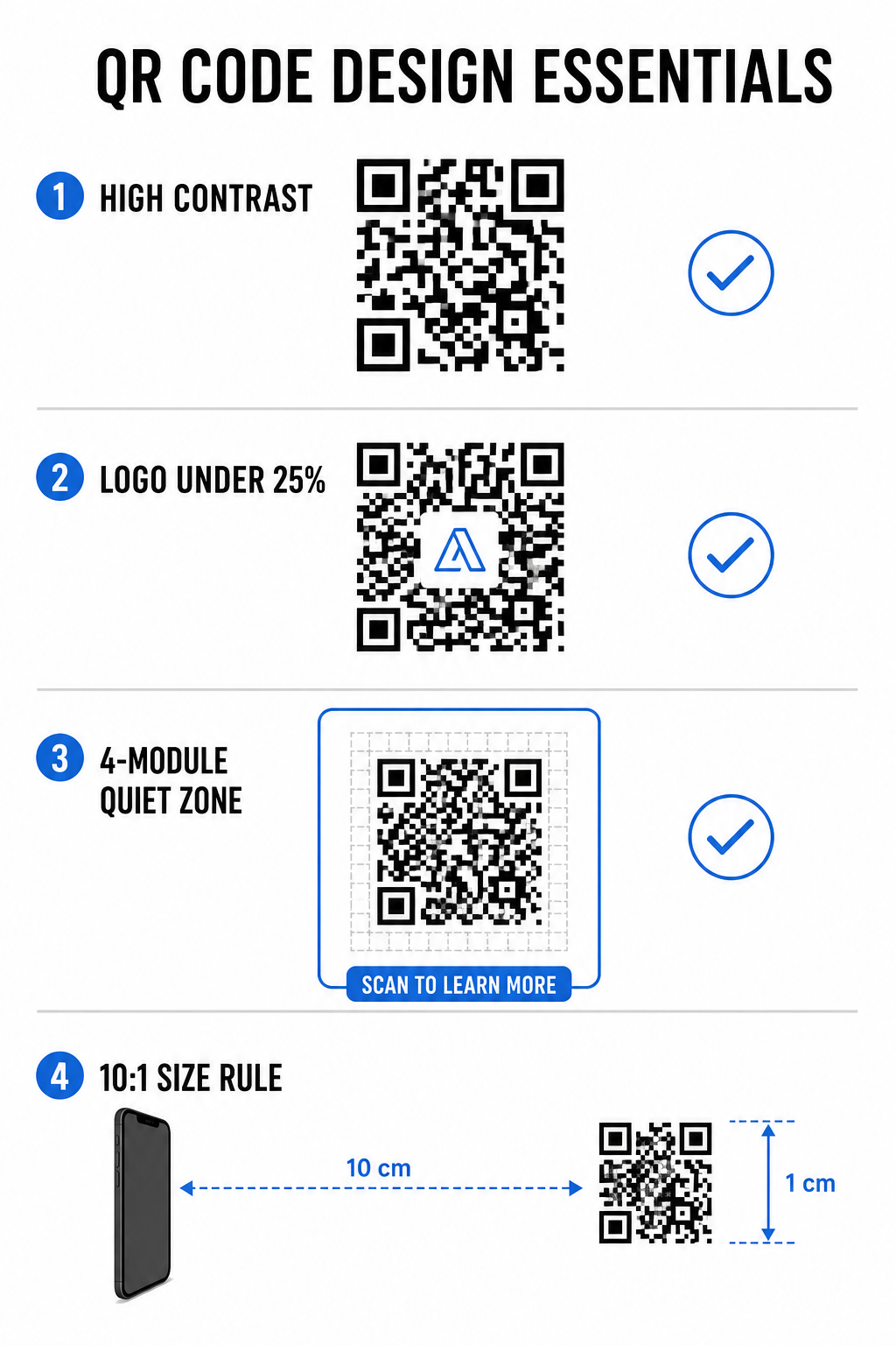
- Center the logo position: Place graphics directly in the center of the grid, ensuring the three large square alignment patterns in the corners remain completely unobstructed.
- Limit total logo coverage: Keep logo dimensions to 25% or less of total QR width and height, never exceeding 30% of the overall surface area.
- Select higher error correction levels: Set Reed-Solomon Error Correction to Level Q (recovers up to 25% of covered data) or Level H (recovers up to 30%) so scanners can reconstruct missing pattern information.
- Protect logo background contrast: Add a plain white border around dark brand icons to prevent logo edges from merging with surrounding pattern modules.
Create Branded QR Codes in Seconds Want to elevate your marketing materials with custom colors, logos, and high-converting frames? Start designing scannable codes today with our QR-kodegenerator med logo.
Frame Your QR Code with Clear Calls to Action
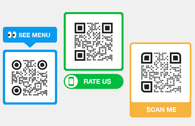
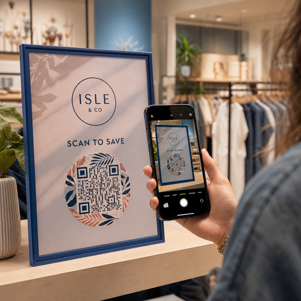
An unlabelled QR code gives customers no compelling reason to scan. Adding a call-to-action (CTA) frame provides immediate context, telling users exactly what value or content awaits them.
Using effective QR code CTA frames helps guide user behavior and increase conversion rates:
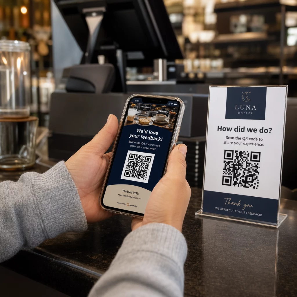
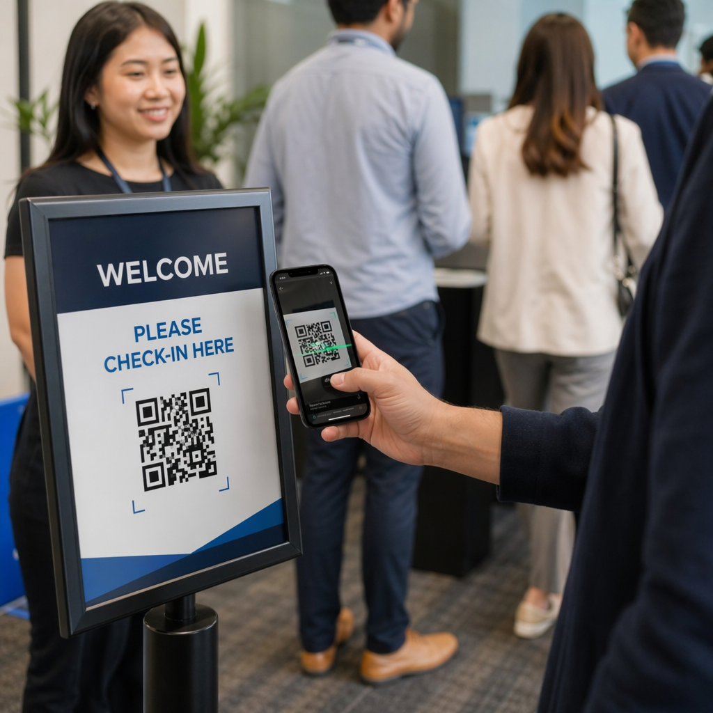
- Add benefit-driven microcopy: Replace generic labels with explicit instructions such as “Scan for 20% Off,” “Scan to View Menu,” or “Scan for Free WiFi.”
- Protect the quiet zone: Maintain an unobstructed margin of at least four modules on all four sides of the code, keeping frame borders and text outside this space.
- Apply pre-built visual templates: Use designed QR-kodeskabeloner to ensure framing matches your print assets while adhering to technical quiet-zone rules.
| Element | Recommended Standard | Hvorfor det er vigtigt |
|---|---|---|
| Quiet Zone Margin | Minimum 4 modules on all sides | Prevents surrounding graphics from disrupting camera recognition |
| Logo Coverage | 20% to 25% of total surface area | Keeps essential data modules readable while maintaining brand visibility |
| Kontrastforhold | Minimum 4.5:1 (small print) / 3:1 (large print) | Guarantees clear distinction between foreground dots and background |
| Minimum printstørrelse | 0,8 x 0,8 tommer (2 x 2 cm) | Ensures standard mobile camera lenses can focus properly at close range |
Scale Code Dimensions for Strategic Physical Placement
Even a visually appealing QR code will fail if physical placement prevents comfortable scanning. Effective positioning requires evaluating viewing distance, surface texture, mounting height, and print scaling.
Following established guidelines for QR-kodeplacering i markedsføring helps ensure reliable performance:
- Calculate dimensions using viewing distance: Apply the 10:1 ratio rule, where every 10 cm of scanning distance requires at least 1 cm of QR code width.
- Position materials at natural viewing heights: Mount signs and print displays between 3.5 and 5.5 feet off the ground so users can scan without ducking or reaching awkward angles.
- Select flat, non-reflective print materials: Choose matte surfaces over glossy laminates or curved packaging to eliminate light glare and pattern distortion.
- Export graphics in high-resolution vector formats: Review broader QR code design tips for better scans to ensure graphics are exported as SVG or EPS files for crisp printing.
Use Dynamic QR Codes to Track and Optimize Campaigns
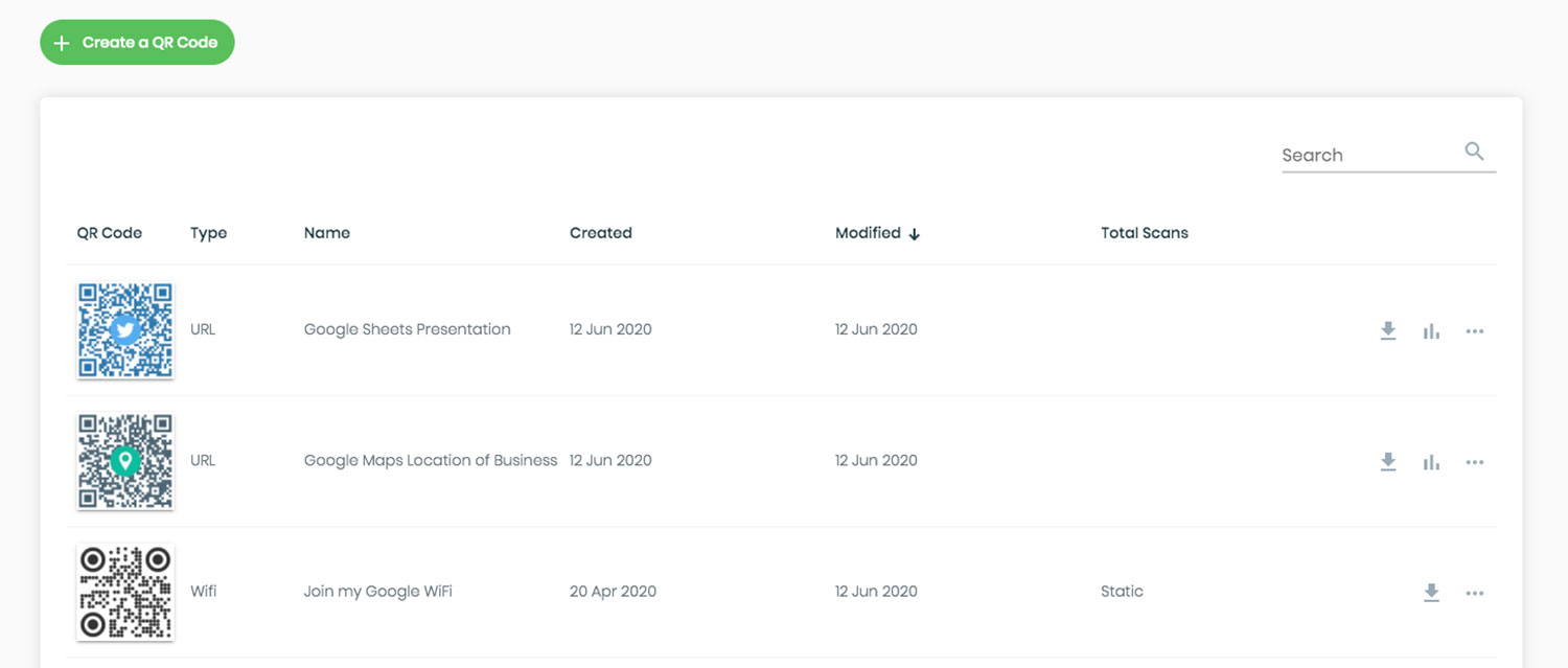
Static QR codes encode target URLs directly into the matrix pattern, resulting in dense grids that are difficult to scan from a distance. Dynamic QR codes route scanners through a short URL, keeping the matrix pattern clean while enabling post-print flexibility.
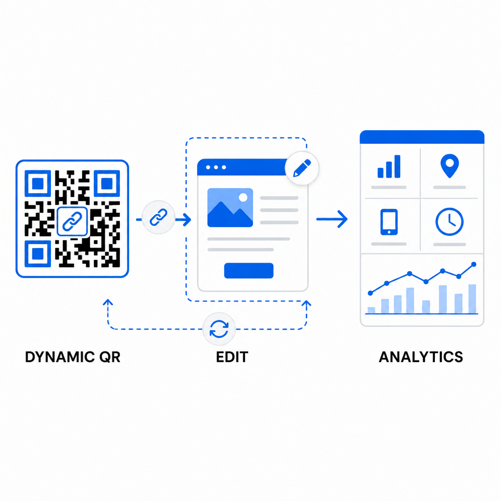
Implementing dynamic workflows supports continuous optimization for forbedring af QR-kodekonverteringsrater:
- Update destination URLs without reprinting: Modify landing page links, promotional offers, or digital files anytime without replacing physical print assets.
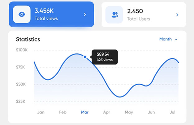
- Capture actionable scan analytics: Track total scans, geographic locations, device types, and scan times to measure campaign performance in real time.
- Perform structured A/B testing: Compare different frame designs, CTAs, or landing pages by changing one variable at a time and tracking unique URLs.
Designing visual QR codes requires balancing creative branding with core technical requirements. By combining strong color contrast, protected quiet zones, action-oriented CTA frames, and dynamic tracking, you can turn physical touchpoints into measurable digital interactions.
Explore our full range of custom QR code features to design high-converting visual assets, or start building your next campaign with the Pageloot QR-kodegenerator i dag.
Ofte stillede spørgsmål
For close-range materials like business cards or restaurant menus, QR codes should be at least 0.8 x 0.8 inches (2 x 2 cm). For signs viewed from a distance, follow the 10:1 ratio rule, where every 10 cm of scanning distance requires at least 1 cm of QR code width.
Adding a logo will not disrupt scanning as long as you set your error correction level to Q or H (which recovers up to 25% or 30% of data) and keep the logo coverage under 25% of the code area without obstructing the corner position markers.
Yes, provided you use a dynamic QR code. Dynamic codes store an editable short URL, allowing you to update the target link or digital content at any time from your management dashboard without reprinting physical materials.