
为什么您的二维码即使设计看起来很专业,也无法吸引客户?扫描过程中的摩擦常常导致交互中断和营销收入损失。本指南提供了可操作的可用性标准,以优化您的二维码,实现更高的转化率和无缝的用户体验。.
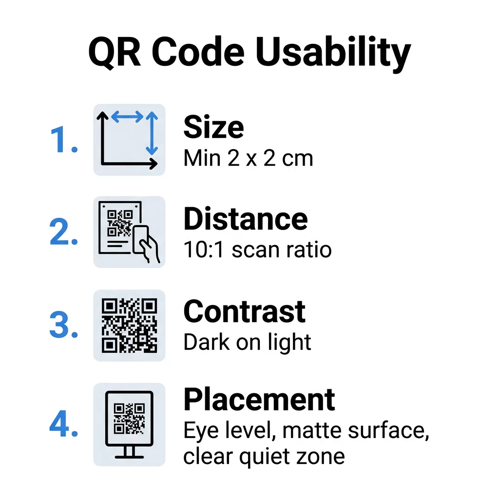
选择最佳尺寸和扫描距离
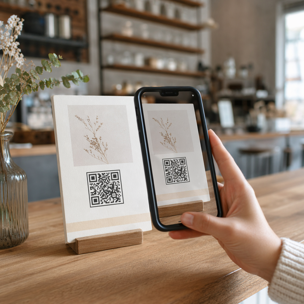
物理尺寸是成功扫描最常见的技术障碍。如果二维码太小,智能手机摄像头无法识别单个模块,尤其是在数据密度较高的情况下。为确保可靠的体验,对于名片或产品包装等近距离物品,您应将最小打印尺寸设为 0.8 x 0.8 英寸(2 x 2 厘米)。.
在为大型显示器设计时,请遵循 10:1 的扫描比例。这意味着如果您预计用户站在 10 英尺(约 3 米)外,二维码的宽度必须至少为 1 英尺(约 30 厘米)才能被准确捕获。此规则对于标牌、橱窗展示或 海报上的二维码 用户与二维码之间的距离变化很大的情况至关重要。.
优化您的营销活动表现 使用我们的 动态二维码生成器 通过使用缩短的重定向 URL,创建即使数据负载很高也能保持可扫描的二维码。.
对比度和数据清晰度设计
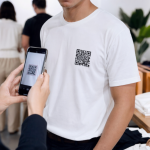
扫描仪依靠明暗模块之间的区别来解码信息。将扫描仪想象成一个高速阅读器,它需要清晰的边缘来区分“开”和“关”数据点。虽然 定制您的二维码 使用品牌颜色可以将参与度提高 18%,但您必须将可扫描性置于美观之上。.
- 深色背景上的浅色:始终将深色前景置于浅色背景上,因为深色吸收更多光线,而浅色反射光线。.
- 对比度:目标是至少 4.5:1 的对比度,以满足 二维码颜色对比度最佳实践 并确保所有用户的可见性。.
- 静区:在二维码周围保持一个清晰的边框,即“静区”,宽度至少为四个模块,以防止周围图形干扰扫描仪。.
- 极简模式: 使用 静态与动态二维码 管理数据密度;动态码通过使用短重定向URL保持模式简洁,这显著提高了扫描速度。.
| 设计特点 | 可用性影响 | 建议 |
|---|---|---|
| 色彩对比 | 高 | 在白色/米色背景上使用深海军蓝或黑色。. |
| 纠错 | 中 | 如果您嵌入品牌标志,请使用H级(30%)。. |
| 表面处理 | 高 | 选择哑光材料以避免“致盲”相机的眩光。. |
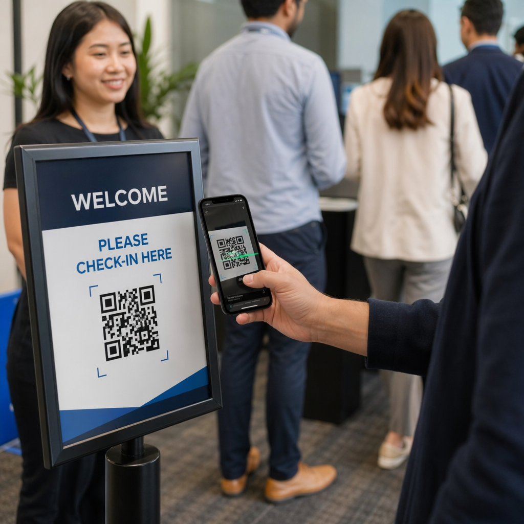
战略性放置以实现最大互动
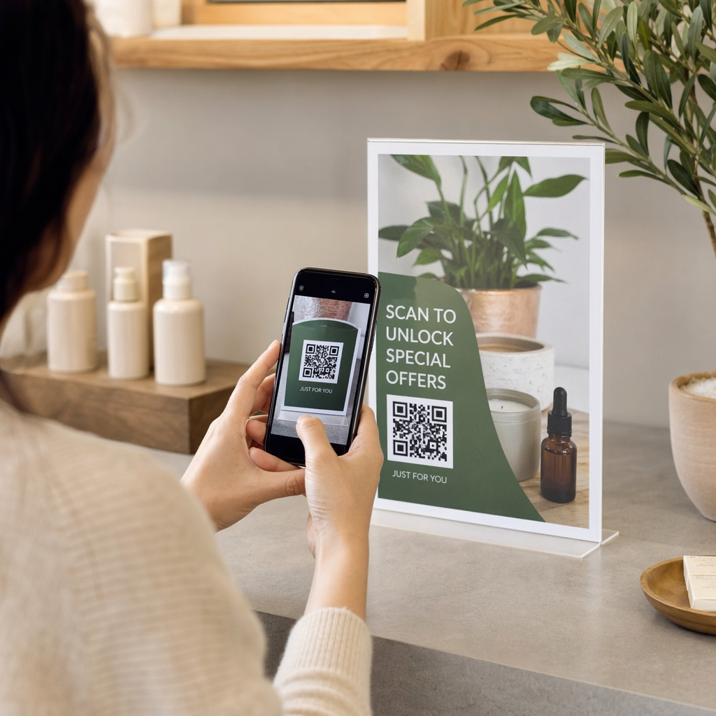
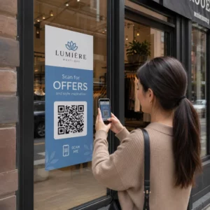
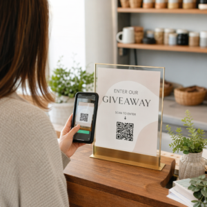
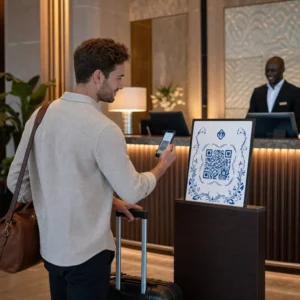
战略性放置决定了用户是注意到您的代码还是完全忽略它。研究表明, 包装上的二维码 其参与度比远距离标牌高出三到四倍,因为用户已经与物品进行了物理互动。.
避免将代码放置在反光或弯曲的表面上,例如玻璃瓶或光面层压板,这些会产生眩光和失真。尽可能将代码放置在视线水平,以符合用户的自然行为。对于零售环境,在销售点放置代码可以在用户意图最强烈时捕捉他们。例如,使用 Google 评论二维码生成器 在收据或桌牌上,让顾客在体验记忆犹新时轻松提供反馈。.
确保包容性设计和可访问性
可用性必须考虑所有潜在用户,包括残障人士。为确保您的数字接触点具有包容性,请遵循既定的 ADA compliance guidelines for QR codes.
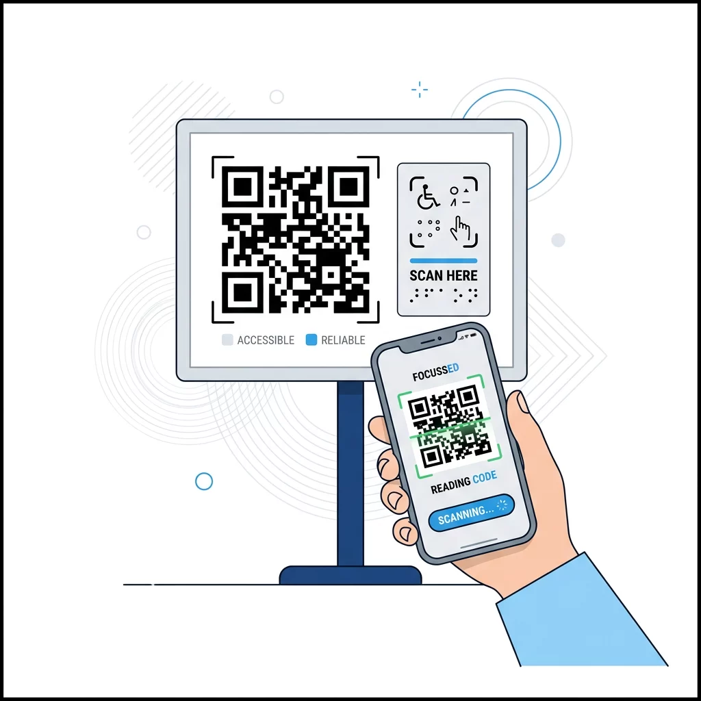
- Placement Height: Install codes between 36 and 48 inches from the floor to ensure they remain reachable for individuals using wheelchairs.
- Audio Alternatives: Incorporate how voice-activated QR codes enhance accessibility by connecting users to narrated content or screen readers.
- Tactile Markers: Provide physical cues or braille near the code to help users with visual impairments locate the scan area.
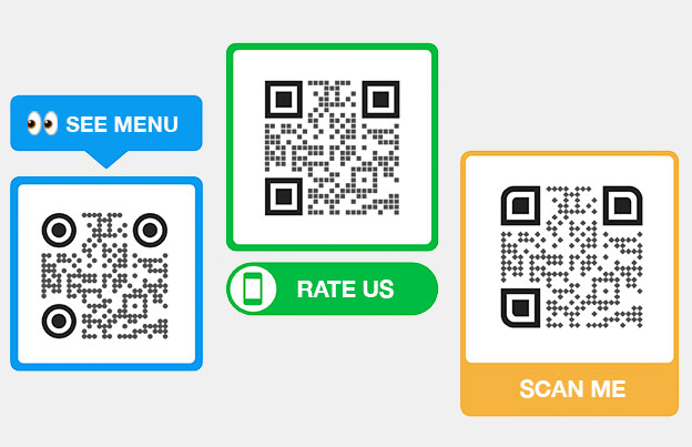
- Explicit Labeling: Never use a “naked” QR code without context; always include a text call-to-action like “Scan to view menu” or “Scan for directions.”
Boost your professional networking Create an accessible digital contact card in seconds with our vCard QR 码生成器.
Testing Protocols for Real-World Reliability
The most expensive mistake a business can make is mass-printing a code that fails in the field. Testing should happen in the actual environment where the code will live, rather than just on a high-resolution monitor.
Test your code across multiple devices, including high-end smartphones and older models with lower-resolution cameras, to ensure universal 可读性. 。检查在各种照明条件下的放置,以考虑阴影或傍晚的昏暗。最后,验证目标链接是否针对移动设备进行了优化并利用了 安全的二维码生成 HTTPS 加密以维护用户信任。.
通过优先考虑用户的扫描体验,您可以将一个简单的图形转化为强大的转化工具。无论您是 设计名片 还是发起零售活动,遵循这些可用性标准是最大化投资回报的关键。.
常见问题
For close-range materials like business cards, the minimum size is 0.8 x 0.8 inches (2 x 2 cm). If the code contains high data density or is intended for distant scanning, follow the 10:1 ratio where the code width is one-tenth of the scanning distance. Why do scanners sometimes fail to read colorful QR codes? Scanners struggle when there is insufficient contrast between the modules and the background. To ensure reliability, maintain at least a 4.5:1 contrast ratio and always use a dark foreground on a light background. Avoid light grays, yellows, or pastels for the modules. What are the benefits of using dynamic QR codes for usability? Dynamic codes allow you to edit the destination URL without reprinting the physical code. They also use a short URL to keep the module pattern simple and “airy,” which makes the code much easier for a QR code scanner to read quickly.


